Case study 03 · Enterprise website · 2025

Enterprise Website UX

Search that’s clearer to use, and a Services page people understand.

On a global consulting firm’s website, search confused people and the Services page lost them. I redesigned search with every state prototyped, then tested the Services page against my prototype with 11 people per version.

Role

Senior UX/UI Designer

Client

Global consulting firm

Year

2025

Methods

Heuristics, interviews, A/B tests
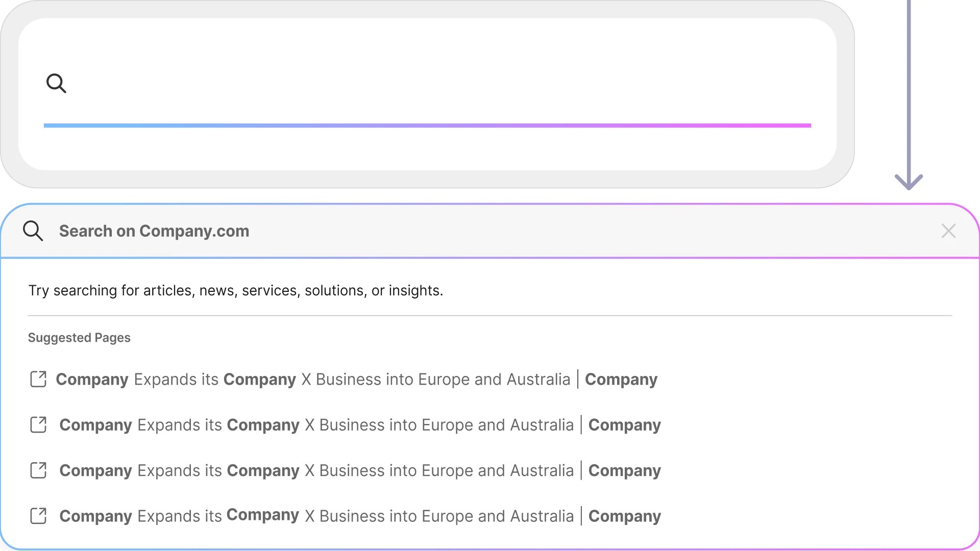
Search panel with a list of suggested results under the search field

Part 1

Global Search Redesign

Challenge

Search on a high-traffic consulting website suggested results before people finished typing, made every result type look the same and offered no clear way out.

What I did

Ran heuristic reviews and user interviews, then designed debounced autosuggest, skeleton loading and separate Clear and Exit actions. I prototyped every state in Figma and documented it for developers.

Outcome

In A/B testing, participants called the new search “easy” and “more clear,” and skeleton screens made it feel faster than the live version.

Skills and tools

Heuristic evaluation

User interviews

A/B testing

Interaction design

Accessibility

Figma prototyping

“Easy.” “More clear.”

How A/B test participants described the new search.
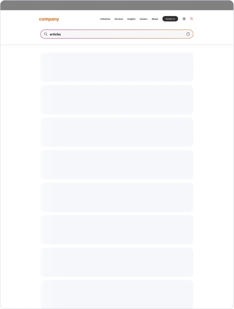
Search page with grey placeholder rows while results for “articles” load

Skeleton loading: placeholders appear the moment a search starts.
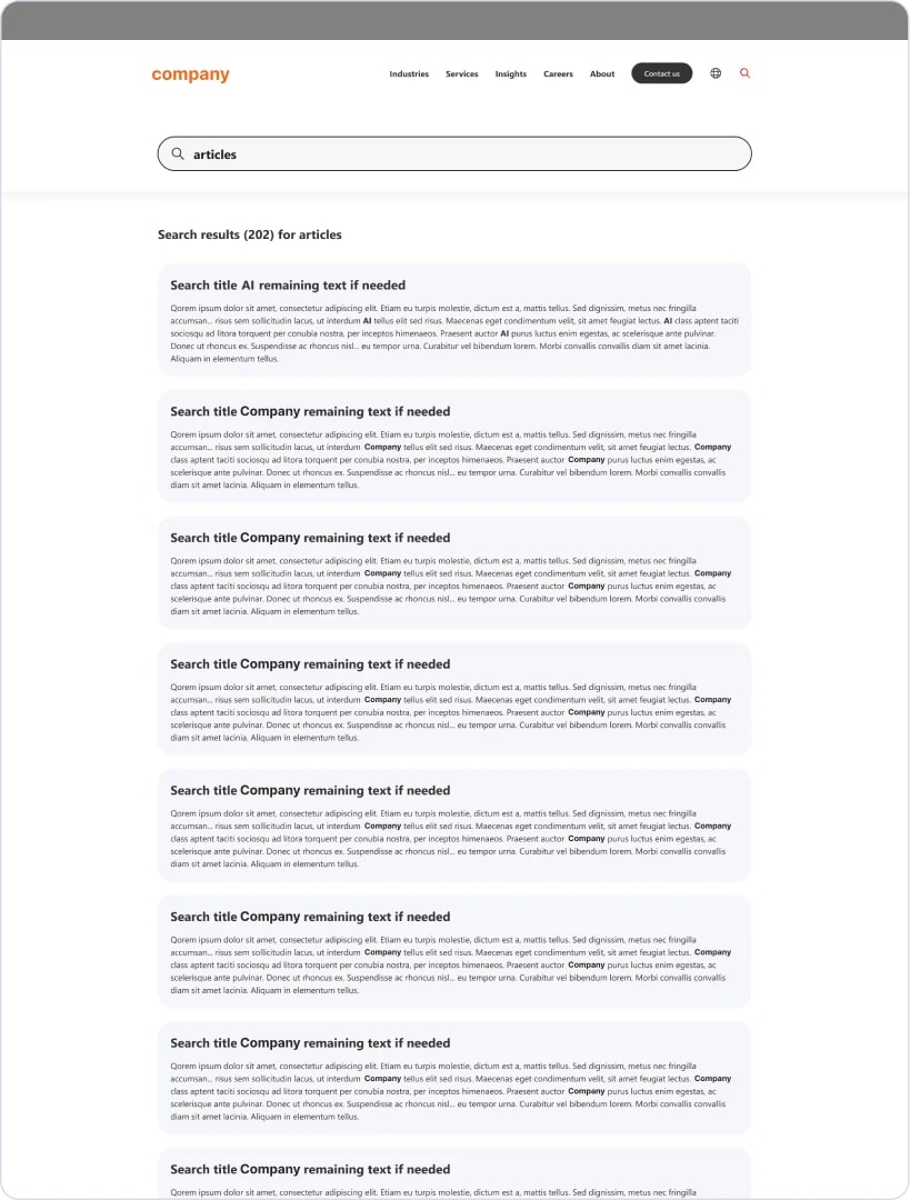
Search results page for “articles” with titled results and short snippets

Results page: clear titles and snippets, with the query kept in view.

Deliverables: a high-fidelity Figma prototype covering interaction, loading and autosuggest states, plus UX documentation for responsive behavior and interaction rules.

Interaction

Every state, prototyped

Typing, suggestions, loading and results, each with real-time feedback so people know the search is working.
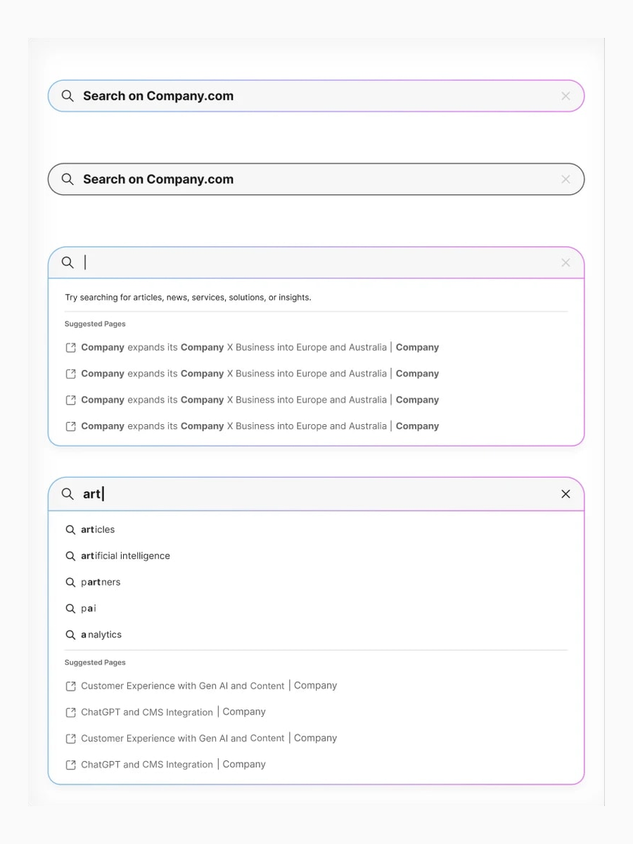
Four search panel states: empty field, typing, suggested results and suggestions updating as a query is typed

Typing and suggestions, with real-time feedback.
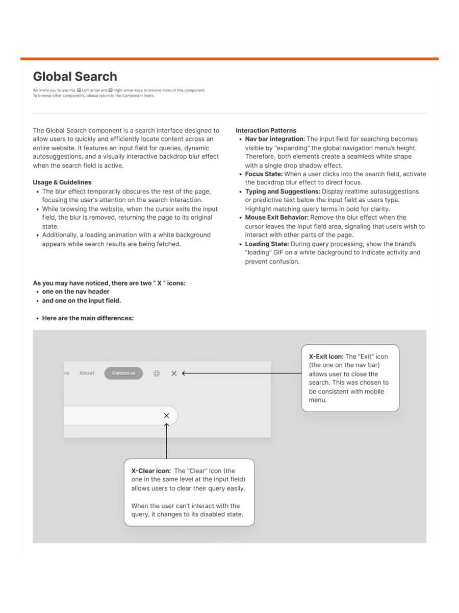
Documentation page for the search panel, with a diagram labelling the separate Clear and Exit X icons

The search panel with separate Clear and Exit actions.

Autosuggest

Debounced suggestions

Suggestions wait until people pause, so results stop jumping while they type.

Clear vs. Exit

Two X icons, two jobs

Two identical X icons now do different jobs: one empties the query, the other closes search. Agreed with developers to keep the flow simple.

Live prototype

Try the search prototype

The Figma prototype we put in front of users during A/B testing.

01

Click the search bar to focus it. The page blurs behind it.

02

Click again, type a query and watch suggestions update.

03

Pick a suggestion to see the loading state and results.

04

Compare the two X icons: one clears the query, the other exits search.

Part 2 · Services research

From findings to fixes

On the same site, I tested the Services page against my prototype. Most problems came from language and structure, not visual style.

Challenge

On the Services page, visitors lost the contact option, mistook card titles for buttons and met jargon in the service names with no explanation.

What I did

Ran a heuristic evaluation against Nielsen’s 10 heuristics with severity ratings, then tested the live page against my Figma prototype with 11 people per version and synthesized their feedback into two reports.

Outcome

Participants preferred the prototype. Nine recommendations followed, plus an A/B plan measuring clicks, form submissions and time to conversion.

Skills and tools

Heuristic evaluation

Usability testing (n=11)

Affinity mapping

A/B test plan

UX writing

Card design

11

people tested on each version

2

written reports, one per version

9

fixes proposed to the team

“The new layout feels more compact and easier to read.”

A participant, comparing the prototype with the live page.
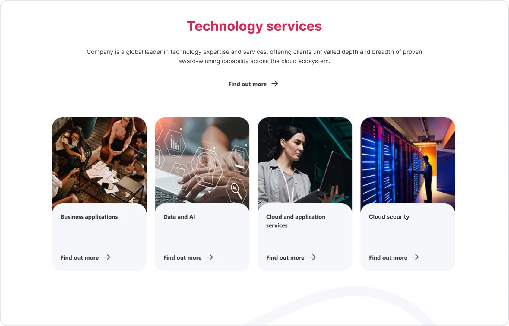
Redesigned Services section with four photo cards: business applications, data and AI, cloud, and cloud security

The redesigned Services page we tested.

Findings

What people told us

Language

Jargon got in the way

Most participants didn’t understand the service names and kept looking for a “Learn more.”

Cards

Titles read as buttons

Card titles read as calls to action, and card styles changed from one section to the next.

Contact

An unclear contact form

People couldn’t tell if it was for sales or general questions, and many lost the contact link while scrolling.

What I recommended

Content

UX copy guidelines

Plain-language rules for the whole site, starting with service names and link labels.

Structure

One card structure

Titles styled apart from links, one card style across sections, and a logical order.

Navigation

Sticky jump links

A jump-link bar that stays visible and keeps the contact link one click away, with the form’s purpose stated.

Cards, before and after
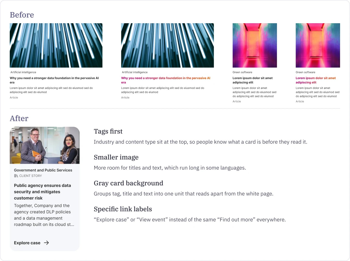
Service cards before and after: the new card puts the tag first, uses a smaller image and a specific link label

Tags first, a smaller image, a gray card background and specific link labels like “Explore case” instead of the same “Find out more” everywhere.

Live prototype

Try the Services prototype

The redesigned Services page we tested against the live site with 11 participants per version.

01

Use the jump links to move between service areas.

02

Compare the cards: titles, tags and links now read differently.

03

Find how to contact an expert, the task participants struggled with most.

Next case study · 04

B2B Ordering Portal

Read case study 04

Case study 03 · Enterprise website · 2025

Enterprise Website UX

Search that’s clearer to use, and a Services page people understand.

On a global consulting firm’s website, search confused people and the Services page lost them. I redesigned search with every state prototyped, then tested the Services page against my prototype with 11 people per version.

Role

Senior UX/UI Designer

Client

Global consulting firm

Year

2025

Methods

Heuristics, interviews, A/B tests

Search panel with a list of suggested results under the search field

Part 1

Global Search Redesign

Challenge

Search on a high-traffic consulting website suggested results before people finished typing, made every result type look the same and offered no clear way out.

What I did

Ran heuristic reviews and user interviews, then designed debounced autosuggest, skeleton loading and separate Clear and Exit actions. I prototyped every state in Figma and documented it for developers.

Outcome

In A/B testing, participants called the new search “easy” and “more clear,” and skeleton screens made it feel faster than the live version.

Skills and tools

Heuristic evaluation

User interviews

A/B testing

Interaction design

Accessibility

Figma prototyping

“Easy.” “More clear.”

How A/B test participants described the new search.

Search page with grey placeholder rows while results for “articles” load

Skeleton loading: placeholders appear the moment a search starts.

Search results page for “articles” with titled results and short snippets

Results page: clear titles and snippets, with the query kept in view.

Deliverables: a high-fidelity Figma prototype covering interaction, loading and autosuggest states, plus UX documentation for responsive behavior and interaction rules.

Interaction

Every state, prototyped

Typing, suggestions, loading and results, each with real-time feedback so people know the search is working.

Four search panel states: empty field, typing, suggested results and suggestions updating as a query is typed

Typing and suggestions, with real-time feedback.

Documentation page for the search panel, with a diagram labelling the separate Clear and Exit X icons

The search panel with separate Clear and Exit actions.

Autosuggest

Debounced suggestions

Suggestions wait until people pause, so results stop jumping while they type.

Clear vs. Exit

Two X icons, two jobs

Two identical X icons now do different jobs: one empties the query, the other closes search. Agreed with developers to keep the flow simple.

Live prototype

Try the search prototype

The Figma prototype we put in front of users during A/B testing.

01

Click the search bar to focus it. The page blurs behind it.

02

Click again, type a query and watch suggestions update.

03

Pick a suggestion to see the loading state and results.

04

Compare the two X icons: one clears the query, the other exits search.

Part 2 · Services research

From findings to fixes

On the same site, I tested the Services page against my prototype. Most problems came from language and structure, not visual style.

Challenge

On the Services page, visitors lost the contact option, mistook card titles for buttons and met jargon in the service names with no explanation.

What I did

Ran a heuristic evaluation against Nielsen’s 10 heuristics with severity ratings, then tested the live page against my Figma prototype with 11 people per version and synthesized their feedback into two reports.

Outcome

Participants preferred the prototype. Nine recommendations followed, plus an A/B plan measuring clicks, form submissions and time to conversion.

Skills and tools

Heuristic evaluation

Usability testing (n=11)

Affinity mapping

A/B test plan

UX writing

Card design

11

people tested on each version

2

written reports, one per version

9

fixes proposed to the team

“The new layout feels more compact and easier to read.”

A participant, comparing the prototype with the live page.

Redesigned Services section with four photo cards: business applications, data and AI, cloud, and cloud security

The redesigned Services page we tested.

Findings

What people told us

Language

Jargon got in the way

Most participants didn’t understand the service names and kept looking for a “Learn more.”

Cards

Titles read as buttons

Card titles read as calls to action, and card styles changed from one section to the next.

Contact

An unclear contact form

People couldn’t tell if it was for sales or general questions, and many lost the contact link while scrolling.

What I recommended

Content

UX copy guidelines

Plain-language rules for the whole site, starting with service names and link labels.

Structure

One card structure

Titles styled apart from links, one card style across sections, and a logical order.

Navigation

Sticky jump links

A jump-link bar that stays visible and keeps the contact link one click away, with the form’s purpose stated.

Cards, before and after

Service cards before and after: the new card puts the tag first, uses a smaller image and a specific link label

Tags first, a smaller image, a gray card background and specific link labels like “Explore case” instead of the same “Find out more” everywhere.

Live prototype

Try the Services prototype

The redesigned Services page we tested against the live site with 11 participants per version.

01

Use the jump links to move between service areas.

02

Compare the cards: titles, tags and links now read differently.

03

Find how to contact an expert, the task participants struggled with most.

Next case study · 04

B2B Ordering Portal

Read case study 04

Case study 03 · Enterprise website · 2025

Enterprise Website UX

Search that’s clearer to use, and a Services page people understand.

On a global consulting firm’s website, search confused people and the Services page lost them. I redesigned search with every state prototyped, then tested the Services page against my prototype with 11 people per version.

Role

Senior UX/UI Designer

Client

Global consulting firm

Year

2025

Methods

Heuristics, interviews, A/B tests

Search panel with a list of suggested results under the search field

Part 1

Global Search Redesign

Challenge

Search on a high-traffic consulting website suggested results before people finished typing, made every result type look the same and offered no clear way out.

What I did

Ran heuristic reviews and user interviews, then designed debounced autosuggest, skeleton loading and separate Clear and Exit actions. I prototyped every state in Figma and documented it for developers.

Outcome

In A/B testing, participants called the new search “easy” and “more clear,” and skeleton screens made it feel faster than the live version.

Skills and tools

Heuristic evaluation

User interviews

A/B testing

Interaction design

Accessibility

Figma prototyping

“Easy.” “More clear.”

How A/B test participants described the new search.

Search page with grey placeholder rows while results for “articles” load

Skeleton loading: placeholders appear the moment a search starts.

Search results page for “articles” with titled results and short snippets

Results page: clear titles and snippets, with the query kept in view.

Deliverables: a high-fidelity Figma prototype covering interaction, loading and autosuggest states, plus UX documentation for responsive behavior and interaction rules.

Interaction

Every state, prototyped

Typing, suggestions, loading and results, each with real-time feedback so people know the search is working.

Four search panel states: empty field, typing, suggested results and suggestions updating as a query is typed

Typing and suggestions, with real-time feedback.

Documentation page for the search panel, with a diagram labelling the separate Clear and Exit X icons

The search panel with separate Clear and Exit actions.

Autosuggest

Debounced suggestions

Suggestions wait until people pause, so results stop jumping while they type.

Clear vs. Exit

Two X icons, two jobs

Two identical X icons now do different jobs: one empties the query, the other closes search. Agreed with developers to keep the flow simple.

Live prototype

Try the search prototype

The Figma prototype we put in front of users during A/B testing.

01

Click the search bar to focus it. The page blurs behind it.

02

Click again, type a query and watch suggestions update.

03

Pick a suggestion to see the loading state and results.

04

Compare the two X icons: one clears the query, the other exits search.

Part 2 · Services research

From findings to fixes

On the same site, I tested the Services page against my prototype. Most problems came from language and structure, not visual style.

Challenge

On the Services page, visitors lost the contact option, mistook card titles for buttons and met jargon in the service names with no explanation.

What I did

Ran a heuristic evaluation against Nielsen’s 10 heuristics with severity ratings, then tested the live page against my Figma prototype with 11 people per version and synthesized their feedback into two reports.

Outcome

Participants preferred the prototype. Nine recommendations followed, plus an A/B plan measuring clicks, form submissions and time to conversion.

Skills and tools

Heuristic evaluation

Usability testing (n=11)

Affinity mapping

A/B test plan

UX writing

Card design

11

people tested on each version

2

written reports, one per version

9

fixes proposed to the team

“The new layout feels more compact and easier to read.”

A participant, comparing the prototype with the live page.

Redesigned Services section with four photo cards: business applications, data and AI, cloud, and cloud security

The redesigned Services page we tested.

Findings

What people told us

Language

Jargon got in the way

Most participants didn’t understand the service names and kept looking for a “Learn more.”

Cards

Titles read as buttons

Card titles read as calls to action, and card styles changed from one section to the next.

Contact

An unclear contact form

People couldn’t tell if it was for sales or general questions, and many lost the contact link while scrolling.

What I recommended

Content

UX copy guidelines

Plain-language rules for the whole site, starting with service names and link labels.

Structure

One card structure

Titles styled apart from links, one card style across sections, and a logical order.

Navigation

Sticky jump links

A jump-link bar that stays visible and keeps the contact link one click away, with the form’s purpose stated.

Cards, before and after

Service cards before and after: the new card puts the tag first, uses a smaller image and a specific link label

Tags first, a smaller image, a gray card background and specific link labels like “Explore case” instead of the same “Find out more” everywhere.

Live prototype

Try the Services prototype

The redesigned Services page we tested against the live site with 11 participants per version.

01

Use the jump links to move between service areas.

02

Compare the cards: titles, tags and links now read differently.

03

Find how to contact an expert, the task participants struggled with most.

Next case study · 04

B2B Ordering Portal

Read case study 04