Case study 01 · Design system · 2024–2025

Expanding an Enterprise Design System

One shared language for motion, from Figma to code.

I expanded an enterprise design system with new components, tokens and dark mode, and wrote its first Motion System Guide so designers and developers animate the same way.

Role

Senior UX/UI Designer

Scope

Components, tokens, motion

Year

2024–2025

Tools

Figma, After Effects, Mural
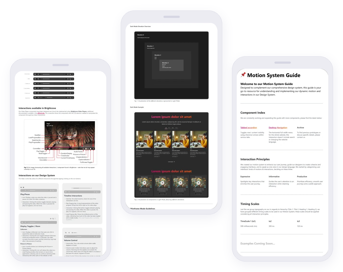
Three pages from the Motion System Guide: component specs, dark-mode components and the guide’s welcome page

Challenge

The design system had solid components but no shared rules for motion, so each team animated its own way and handoff relied on guesswork.

What I did

Added new components, dark-mode variants and tokens to the Figma library, wrote the first Motion System Guide (principles, timing scales, animation specs) and tested Figma plugins for exporting animation to code.

Outcome

Designers and developers got one documented reference for motion, from After Effects exploration to Lottie and CSS.

Skills and tools

Atomic design

Design tokens

Dark mode

Motion principles

After Effects to Lottie

Documentation

Plugin evaluation

20

responsive components, with tokens

10

interactive prototypes

2

design systems

1

promo campaign built with the new components

Process

From research to release

I audited the library for missing organisms, then built them from new atoms, molecules and tokens. Each component shipped with variants, use cases and a dark mode, checked for consistency and ease of implementation.
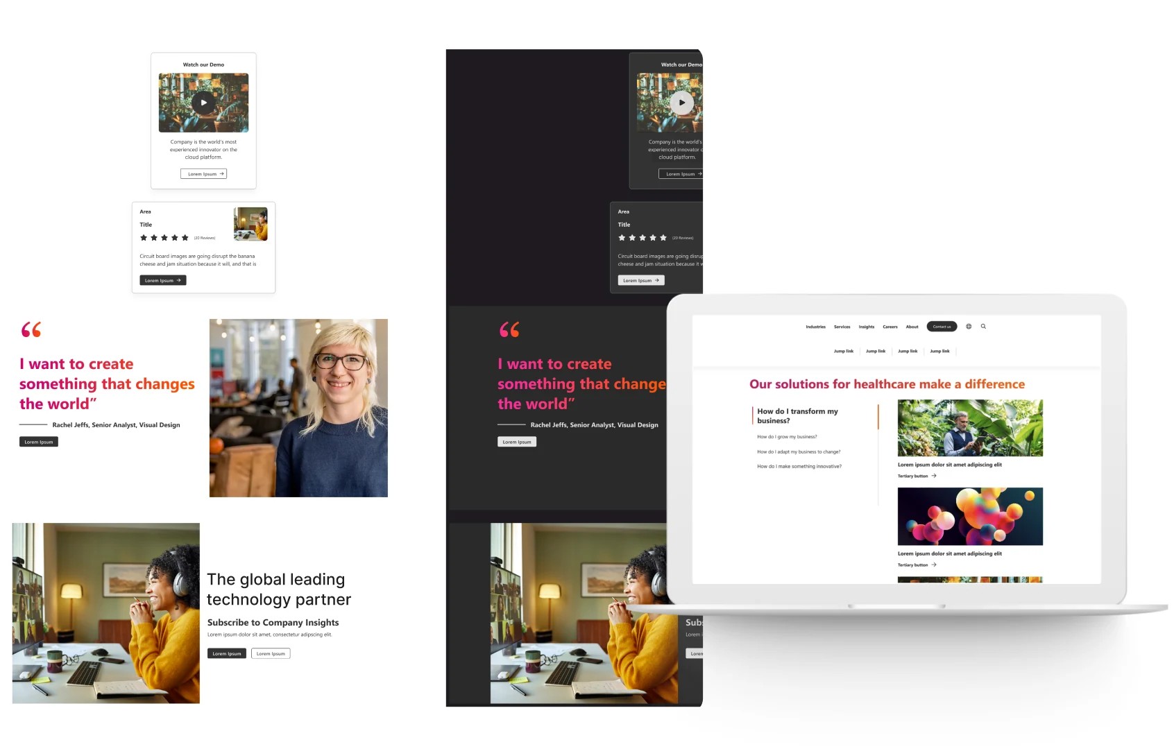
Light and dark versions of a page built with the new components, also shown on a laptop

New organisms in use on a dark-mode page.

Motion System Guide

Motion language

Principles set the intent of a movement, and the timing scale sets its duration. Both live in the Motion System Guide, the shared vocabulary for motion from design to code.

Interaction principles

Expressive

Spotlights key interactions that enrich the user journey.

Informative

Guides attention to an interaction while keeping it efficient.

Productive

Puts efficiency first: smooth journeys, subtle motion.

Timing scale

500 ms

300 ms

120 ms

Component spec

Usage, text limits and responsive rules, all written for developers.
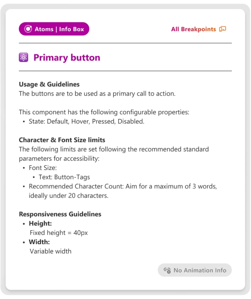
Component page from the Motion System Guide with usage, text limits and responsive rules

A component page from the guide.

Output

From motion idea to working code

I tested Figma plugins for exporting animation and documented the path developers should follow.

The motion pipeline

01

Figma

Components, variants and prototypes

02

After Effects

Motion explored and timed

03

Plugin evaluation

A report comparing export options

04

Lottie + CSS

What developers implement

What teams got

Guide

Motion System Guide

Component index, principles and timing, browsable as a prototype for developers and designers.

Report

Plugin evaluation

A comparison of Figma plugins for exporting animation, to cut rework between design and code.

Campaign

Promo campaign

One promo campaign built with the new components and motion.

Specs

Specs developers can build from

Components shipped with named parts, clear behavior and both color modes.

Every control named, in light and dark
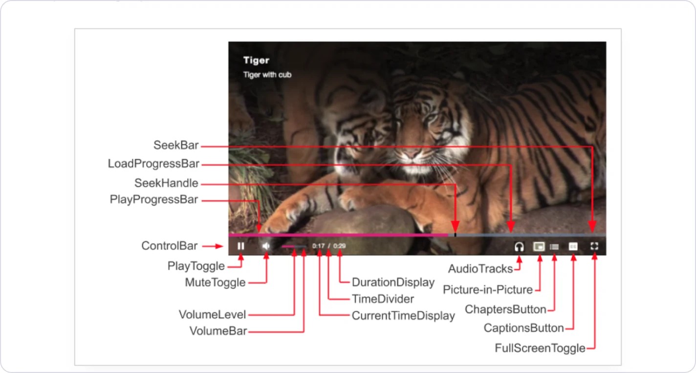
Video player diagram with every control labelled, from SeekBar to FullScreenToggle

Video player: every part named for developers, from SeekBar to FullScreenToggle.

Four elevation levels shown side by side in light mode and dark mode

Four elevation levels in both modes: each surface steps up in tone, so hierarchy holds when the theme switches.

Behavior, written down

Play / Pause

One button, two states

It toggles playback, and the icon always shows the next action: play when paused, pause when playing.

Timeline

Three bars, one track

Seek, progress and buffered load share one track, so people see where they are and what is ready.

Volume

Hidden until needed

The slider appears on hover, and clicking the speaker mutes the video and shows a cross.

Next case study · 02

Music and TV Campaigns

Read case study 02

Case study 01 · Design system · 2024–2025

Expanding an Enterprise Design System

One shared language for motion, from Figma to code.

I expanded an enterprise design system with new components, tokens and dark mode, and wrote its first Motion System Guide so designers and developers animate the same way.

Role

Senior UX/UI Designer

Scope

Components, tokens, motion

Year

2024–2025

Tools

Figma, After Effects, Mural

Three pages from the Motion System Guide: component specs, dark-mode components and the guide’s welcome page

Challenge

The design system had solid components but no shared rules for motion, so each team animated its own way and handoff relied on guesswork.

What I did

Added new components, dark-mode variants and tokens to the Figma library, wrote the first Motion System Guide (principles, timing scales, animation specs) and tested Figma plugins for exporting animation to code.

Outcome

Designers and developers got one documented reference for motion, from After Effects exploration to Lottie and CSS.

Skills and tools

Atomic design

Design tokens

Dark mode

Motion principles

After Effects to Lottie

Documentation

Plugin evaluation

20

responsive components, with tokens

10

interactive prototypes

2

design systems

1

promo campaign built with the new components

Process

From research to release

I audited the library for missing organisms, then built them from new atoms, molecules and tokens. Each component shipped with variants, use cases and a dark mode, checked for consistency and ease of implementation.

Light and dark versions of a page built with the new components, also shown on a laptop

New organisms in use on a dark-mode page.

Motion System Guide

Motion language

Principles set the intent of a movement, and the timing scale sets its duration. Both live in the Motion System Guide, the shared vocabulary for motion from design to code.

Interaction principles

Expressive

Spotlights key interactions that enrich the user journey.

Informative

Guides attention to an interaction while keeping it efficient.

Productive

Puts efficiency first: smooth journeys, subtle motion.

Timing scale

500 ms

300 ms

120 ms

Component spec

Usage, text limits and responsive rules, all written for developers.

Component page from the Motion System Guide with usage, text limits and responsive rules

A component page from the guide.

Output

From motion idea to working code

I tested Figma plugins for exporting animation and documented the path developers should follow.

The motion pipeline

01

Figma

Components, variants and prototypes

02

After Effects

Motion explored and timed

03

Plugin evaluation

A report comparing export options

04

Lottie + CSS

What developers implement

What teams got

Guide

Motion System Guide

Component index, principles and timing, browsable as a prototype for developers and designers.

Report

Plugin evaluation

A comparison of Figma plugins for exporting animation, to cut rework between design and code.

Campaign

Promo campaign

One promo campaign built with the new components and motion.

Specs

Specs developers can build from

Components shipped with named parts, clear behavior and both color modes.

Every control named, in light and dark

Video player: every part named for developers, from SeekBar to FullScreenToggle.
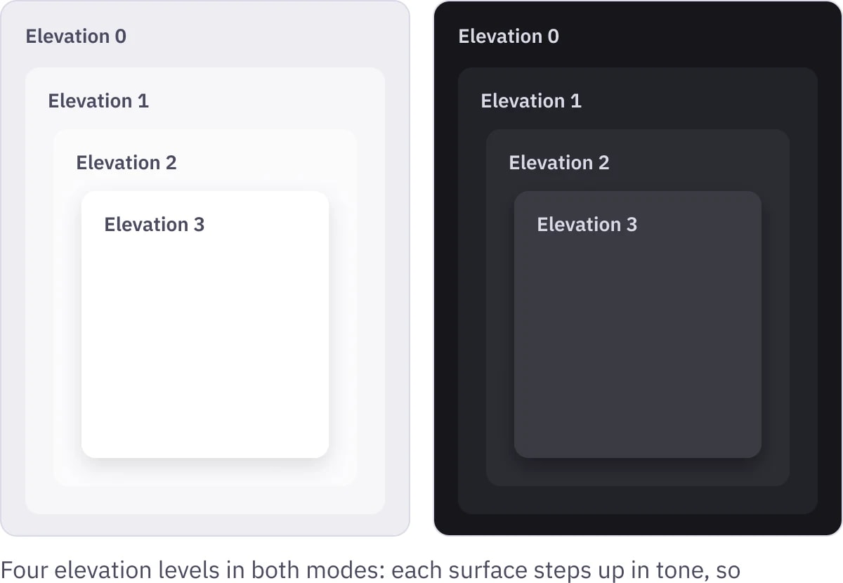
Four elevation levels shown side by side in light mode and dark mode

Four elevation levels in both modes: each surface steps up in tone, so hierarchy holds when the theme switches.

Behavior, written down

Play / Pause

One button, two states

It toggles playback, and the icon always shows the next action: play when paused, pause when playing.

Timeline

Three bars, one track

Seek, progress and buffered load share one track, so people see where they are and what is ready.

Volume

Hidden until needed

The slider appears on hover, and clicking the speaker mutes the video and shows a cross.

Next case study · 02

Music and TV Campaigns

Read case study 02

Case study 01 · Design system · 2024–2025

Expanding an Enterprise Design System

One shared language for motion, from Figma to code.

I expanded an enterprise design system with new components, tokens and dark mode, and wrote its first Motion System Guide so designers and developers animate the same way.

Role

Senior UX/UI Designer

Scope

Components, tokens, motion

Year

2024–2025

Tools

Figma, After Effects, Mural

Three pages from the Motion System Guide: component specs, dark-mode components and the guide’s welcome page

Challenge

The design system had solid components but no shared rules for motion, so each team animated its own way and handoff relied on guesswork.

What I did

Added new components, dark-mode variants and tokens to the Figma library, wrote the first Motion System Guide (principles, timing scales, animation specs) and tested Figma plugins for exporting animation to code.

Outcome

Designers and developers got one documented reference for motion, from After Effects exploration to Lottie and CSS.

Skills and tools

Atomic design

Design tokens

Dark mode

Motion principles

After Effects to Lottie

Documentation

Plugin evaluation

20

responsive components, with tokens

10

interactive prototypes

2

design systems

1

promo campaign built with the new components

Process

From research to release

I audited the library for missing organisms, then built them from new atoms, molecules and tokens. Each component shipped with variants, use cases and a dark mode, checked for consistency and ease of implementation.

Light and dark versions of a page built with the new components, also shown on a laptop

New organisms in use on a dark-mode page.

Motion System Guide

Motion language

Principles set the intent of a movement, and the timing scale sets its duration. Both live in the Motion System Guide, the shared vocabulary for motion from design to code.

Interaction principles

Expressive

Spotlights key interactions that enrich the user journey.

Informative

Guides attention to an interaction while keeping it efficient.

Productive

Puts efficiency first: smooth journeys, subtle motion.

Timing scale

500 ms

300 ms

120 ms

Component spec

Usage, text limits and responsive rules, all written for developers.

Component page from the Motion System Guide with usage, text limits and responsive rules

A component page from the guide.

Output

From motion idea to working code

I tested Figma plugins for exporting animation and documented the path developers should follow.

The motion pipeline

01

Figma

Components, variants and prototypes

02

After Effects

Motion explored and timed

03

Plugin evaluation

A report comparing export options

04

Lottie + CSS

What developers implement

What teams got

Guide

Motion System Guide

Component index, principles and timing, browsable as a prototype for developers and designers.

Report

Plugin evaluation

A comparison of Figma plugins for exporting animation, to cut rework between design and code.

Campaign

Promo campaign

One promo campaign built with the new components and motion.

Specs

Specs developers can build from

Components shipped with named parts, clear behavior and both color modes.

Every control named, in light and dark

Video player: every part named for developers, from SeekBar to FullScreenToggle.

Four elevation levels shown side by side in light mode and dark mode

Four elevation levels in both modes: each surface steps up in tone, so hierarchy holds when the theme switches.

Behavior, written down

Play / Pause

One button, two states

It toggles playback, and the icon always shows the next action: play when paused, pause when playing.

Timeline

Three bars, one track

Seek, progress and buffered load share one track, so people see where they are and what is ready.

Volume

Hidden until needed

The slider appears on hover, and clicking the speaker mutes the video and shows a cross.

Next case study · 02

Music and TV Campaigns

Read case study 02