Portfolio

Case study 06 · Website + design system · 2026

NEK Logistics Website

Credibility without stats, design without photos.

A Mexican freight carrier had a one-page site hidden from Google and no new stats or photos to show. I turned its real route network into the proof and built a brand system and a site ready to publish from Figma Sites.

Role

Brand & Product Designer

Client

NEK Logistics

Year

2026

Built with

Figma Sites
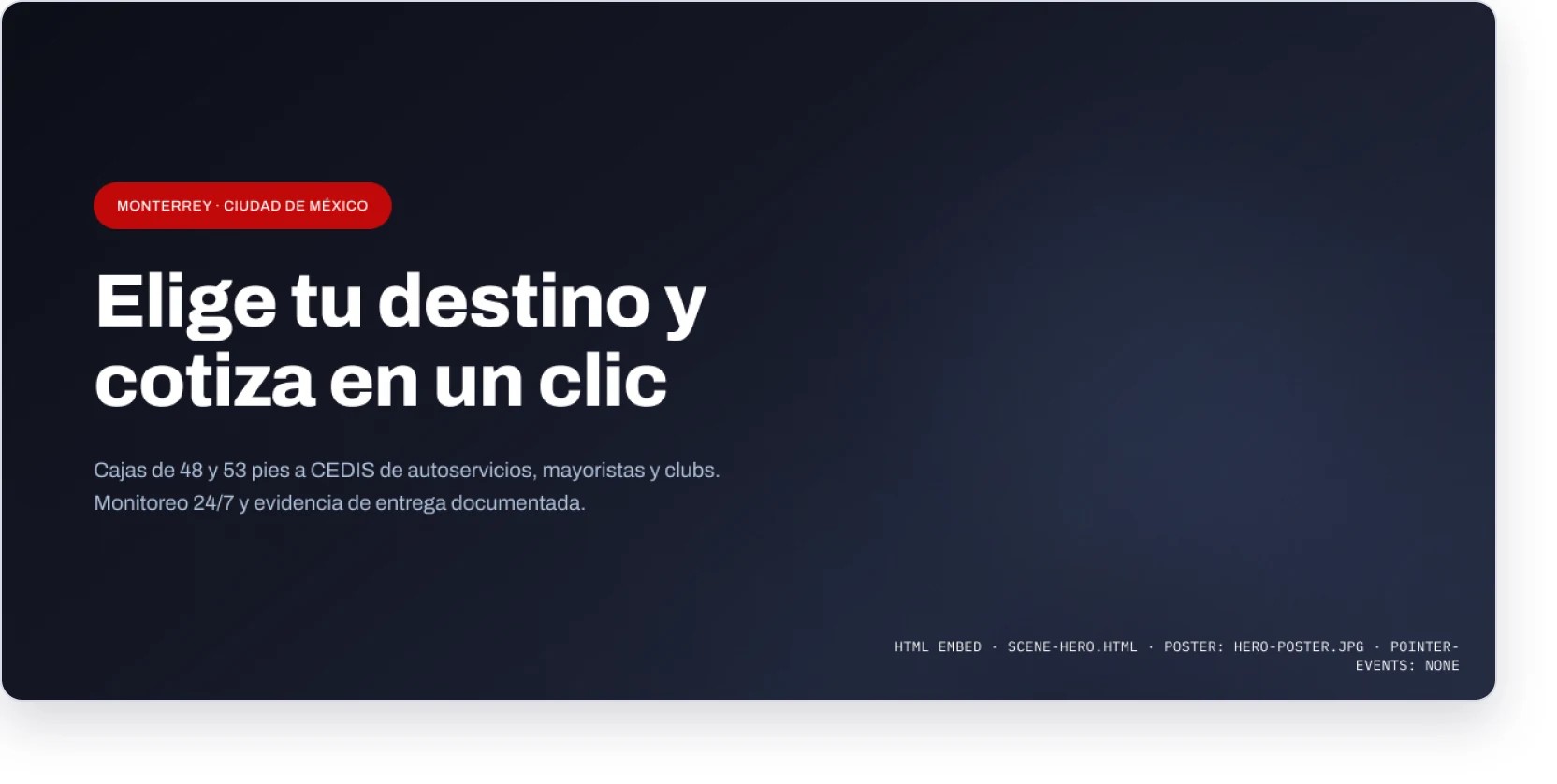
NEK Logistics homepage hero reading “Elige tu destino y cotiza en un clic”, with the Monterrey and Ciudad de México origins

Challenge

A national freight carrier had a Wix one-pager hidden from Google by a noindex tag, with no way to request a quote. No new stats, testimonials or photos were coming.

What I did

Turned both limits into the concept: operational detail as proof, and the real route network as the signature. I built the design system, explored five directions and designed four pages at three breakpoints.

Outcome

A complete site ready to publish from Figma Sites, with a clear quote path, routes as indexable text, AA contrast on every color pair and under 1 MB of images per page.

Skills and tools

Brand system

Figma variables

Information design

Motion spec

Figma Sites

UX writing (ES)

12

real routes, traced on actual roads

5

directions from the same library

4

pages, each at three screen sizes

90

variables across three token sets

20+

components with every state built

<1 MB

of images per page

Website

The route network as proof

The quote path sits above the fold, and the real route network carries the brand.
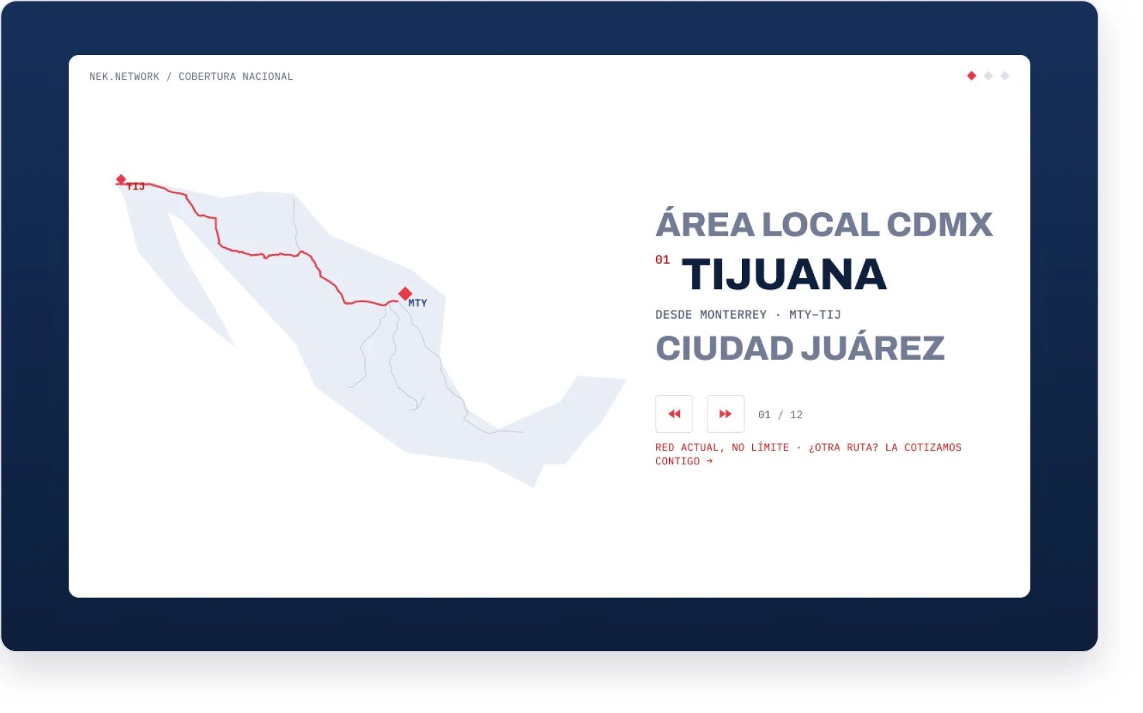
Route map of Mexico tracing a NEK route from Monterrey to Tijuana, next to a list of destinations

The route map: 12 real routes.

Process

Five directions, one decision

With no numbers or photos to lean on, every direction had to earn trust through the operation itself.
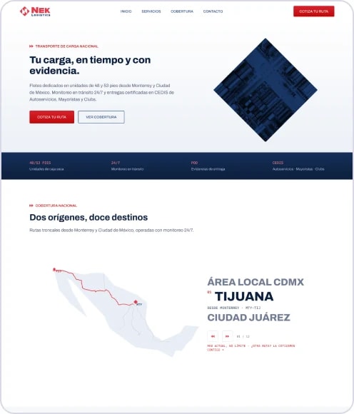
Direction A homepage: headline “Tu carga, en tiempo y con evidencia” with a diamond pattern and the route map

A · Faithful evolution

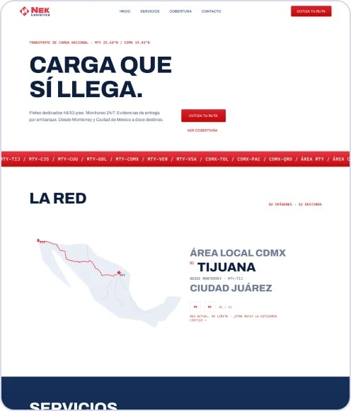
Direction B homepage: bold headline “Carga que sí llega” over a red route ticker and the route map

B · Industrial editorial

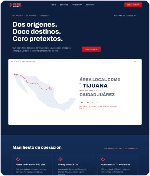
Direction C homepage on dark navy: “Dos orígenes. Doce destinos. Cero pretextos.” with the route map

C · Control tower (accents)

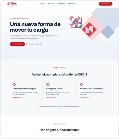
Direction D homepage: “Una nueva forma de mover tu carga” with stacked diamond shapes and service cards

D · Friendly corporate

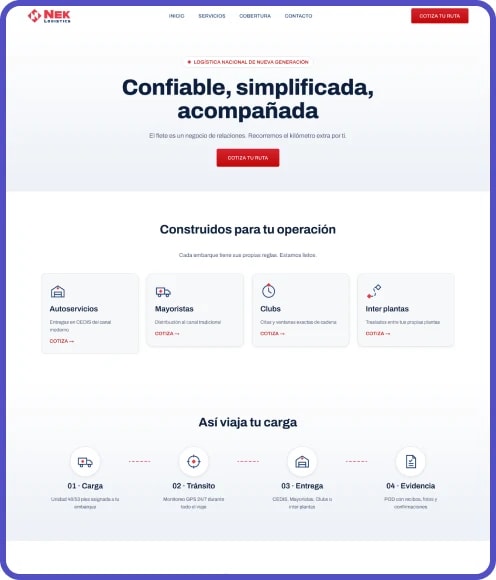
Direction E homepage: “Confiable, simplificada, acompañada” with customer types and a four-step shipment timeline

E · Visual didactic (final)

Why E, with accents from C

Proof

Routes as evidence

Each route was traced with real road data from OpenStreetMap, including a corridor that stays inside Mexico.

Clarity

Didactic for buyers

A process diagram, operations icons and segment tiles speak to supply chain managers.

Signature

Control-tower moments

Dark monitoring sections borrowed from C give the brand one memorable beat.

System

A system built to publish

Everything stays within what Figma Sites can actually build and publish.
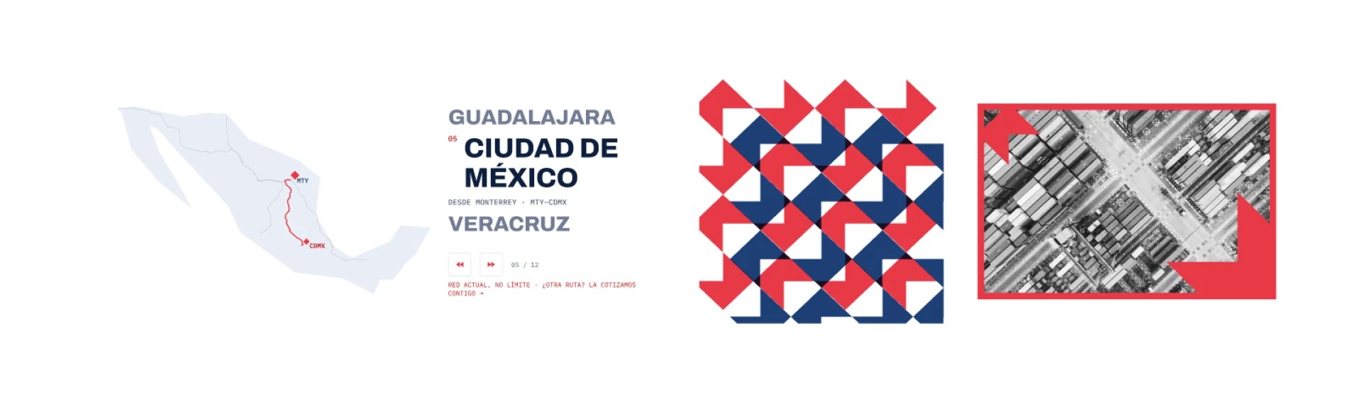
Brand foundations: a route map with city names, a red and navy diamond pattern and a red-framed aerial photo

Brand foundations: diamond, patterns and color.
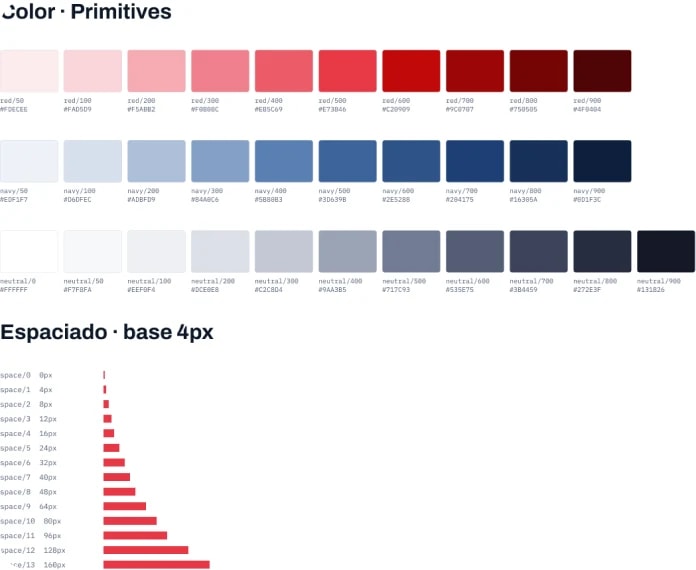
Color primitives in red, navy and neutral scales, above a spacing scale built on a 4px base

Color foundations.

Decisions that hold up

Accessibility

A brand red that passes

The original red fails AA on text, so the system adds a text red and an inverse red.

Type

Fonts with a job

Archivo carries the voice. IBM Plex Mono is reserved for operational data, like a waybill.

Performance

Light and calm

Maps, icons and patterns are vectors, so each page stays under 1 MB of images. Motion respects reduced-motion settings.

Live prototype

Try the prototype

The home page with its real interactions, straight from the Figma file.

01

Scroll the home page from hero to quote request.

02

Step through the route carousel to see each of the 12 routes.

03

Hover buttons and cards for the micro-interactions.

More work

Imagining a New Currency

See the project

Portfolio

Case study 06 · Website + design system · 2026

NEK Logistics Website

Credibility without stats, design without photos.

A Mexican freight carrier had a one-page site hidden from Google and no new stats or photos to show. I turned its real route network into the proof and built a brand system and a site ready to publish from Figma Sites.

Role

Brand & Product Designer

Client

NEK Logistics

Year

2026

Built with

Figma Sites

NEK Logistics homepage hero reading “Elige tu destino y cotiza en un clic”, with the Monterrey and Ciudad de México origins

Challenge

A national freight carrier had a Wix one-pager hidden from Google by a noindex tag, with no way to request a quote. No new stats, testimonials or photos were coming.

What I did

Turned both limits into the concept: operational detail as proof, and the real route network as the signature. I built the design system, explored five directions and designed four pages at three breakpoints.

Outcome

A complete site ready to publish from Figma Sites, with a clear quote path, routes as indexable text, AA contrast on every color pair and under 1 MB of images per page.

Skills and tools

Brand system

Figma variables

Information design

Motion spec

Figma Sites

UX writing (ES)

12

real routes, traced on actual roads

5

directions from the same library

4

pages, each at three screen sizes

90

variables across three token sets

20+

components with every state built

<1 MB

of images per page

Website

The route network as proof

The quote path sits above the fold, and the real route network carries the brand.

Route map of Mexico tracing a NEK route from Monterrey to Tijuana, next to a list of destinations

The route map: 12 real routes.

Process

Five directions, one decision

With no numbers or photos to lean on, every direction had to earn trust through the operation itself.

Direction A homepage: headline “Tu carga, en tiempo y con evidencia” with a diamond pattern and the route map

A · Faithful evolution

Direction B homepage: bold headline “Carga que sí llega” over a red route ticker and the route map

B · Industrial editorial

Direction C homepage on dark navy: “Dos orígenes. Doce destinos. Cero pretextos.” with the route map

C · Control tower (accents)

Direction D homepage: “Una nueva forma de mover tu carga” with stacked diamond shapes and service cards

D · Friendly corporate

Direction E homepage: “Confiable, simplificada, acompañada” with customer types and a four-step shipment timeline

E · Visual didactic (final)

Why E, with accents from C

Proof

Routes as evidence

Each route was traced with real road data from OpenStreetMap, including a corridor that stays inside Mexico.

Clarity

Didactic for buyers

A process diagram, operations icons and segment tiles speak to supply chain managers.

Signature

Control-tower moments

Dark monitoring sections borrowed from C give the brand one memorable beat.

System

A system built to publish

Everything stays within what Figma Sites can actually build and publish.

Brand foundations: a route map with city names, a red and navy diamond pattern and a red-framed aerial photo

Brand foundations: diamond, patterns and color.

Color primitives in red, navy and neutral scales, above a spacing scale built on a 4px base

Color foundations.

Decisions that hold up

Accessibility

A brand red that passes

The original red fails AA on text, so the system adds a text red and an inverse red.

Type

Fonts with a job

Archivo carries the voice. IBM Plex Mono is reserved for operational data, like a waybill.

Performance

Light and calm

Maps, icons and patterns are vectors, so each page stays under 1 MB of images. Motion respects reduced-motion settings.

Live prototype

Try the prototype

The home page with its real interactions, straight from the Figma file.

01

Scroll the home page from hero to quote request.

02

Step through the route carousel to see each of the 12 routes.

03

Hover buttons and cards for the micro-interactions.

More work

Imagining a New Currency

See the project

Case study 06 · Website + design system · 2026

NEK Logistics Website

Credibility without stats, design without photos.

A Mexican freight carrier had a one-page site hidden from Google and no new stats or photos to show. I turned its real route network into the proof and built a brand system and a site ready to publish from Figma Sites.

Role

Brand & Product Designer

Client

NEK Logistics

Year

2026

Built with

Figma Sites

NEK Logistics homepage hero reading “Elige tu destino y cotiza en un clic”, with the Monterrey and Ciudad de México origins

Challenge

A national freight carrier had a Wix one-pager hidden from Google by a noindex tag, with no way to request a quote. No new stats, testimonials or photos were coming.

What I did

Turned both limits into the concept: operational detail as proof, and the real route network as the signature. I built the design system, explored five directions and designed four pages at three breakpoints.

Outcome

A complete site ready to publish from Figma Sites, with a clear quote path, routes as indexable text, AA contrast on every color pair and under 1 MB of images per page.

Skills and tools

Brand system

Figma variables

Information design

Motion spec

Figma Sites

UX writing (ES)

12

real routes, traced on actual roads

5

directions from the same library

4

pages, each at three screen sizes

90

variables across three token sets

20+

components with every state built

<1 MB

of images per page

Website

The route network as proof

The quote path sits above the fold, and the real route network carries the brand.

Route map of Mexico tracing a NEK route from Monterrey to Tijuana, next to a list of destinations

The route map: 12 real routes.

Process

Five directions, one decision

With no numbers or photos to lean on, every direction had to earn trust through the operation itself.

Direction A homepage: headline “Tu carga, en tiempo y con evidencia” with a diamond pattern and the route map

A · Faithful evolution

Direction B homepage: bold headline “Carga que sí llega” over a red route ticker and the route map

B · Industrial editorial

Direction C homepage on dark navy: “Dos orígenes. Doce destinos. Cero pretextos.” with the route map

C · Control tower (accents)

Direction D homepage: “Una nueva forma de mover tu carga” with stacked diamond shapes and service cards

D · Friendly corporate

Direction E homepage: “Confiable, simplificada, acompañada” with customer types and a four-step shipment timeline

E · Visual didactic (final)

Why E, with accents from C

Proof

Routes as evidence

Each route was traced with real road data from OpenStreetMap, including a corridor that stays inside Mexico.

Clarity

Didactic for buyers

A process diagram, operations icons and segment tiles speak to supply chain managers.

Signature

Control-tower moments

Dark monitoring sections borrowed from C give the brand one memorable beat.

System

A system built to publish

Everything stays within what Figma Sites can actually build and publish.

Brand foundations: a route map with city names, a red and navy diamond pattern and a red-framed aerial photo

Brand foundations: diamond, patterns and color.

Color primitives in red, navy and neutral scales, above a spacing scale built on a 4px base

Color foundations.

Decisions that hold up

Accessibility

A brand red that passes

The original red fails AA on text, so the system adds a text red and an inverse red.

Type

Fonts with a job

Archivo carries the voice. IBM Plex Mono is reserved for operational data, like a waybill.

Performance

Light and calm

Maps, icons and patterns are vectors, so each page stays under 1 MB of images. Motion respects reduced-motion settings.

Live prototype

Try the prototype

The home page with its real interactions, straight from the Figma file.

01

Scroll the home page from hero to quote request.

02

Step through the route carousel to see each of the 12 routes.

03

Hover buttons and cards for the micro-interactions.

More work

Imagining a New Currency

See the project