
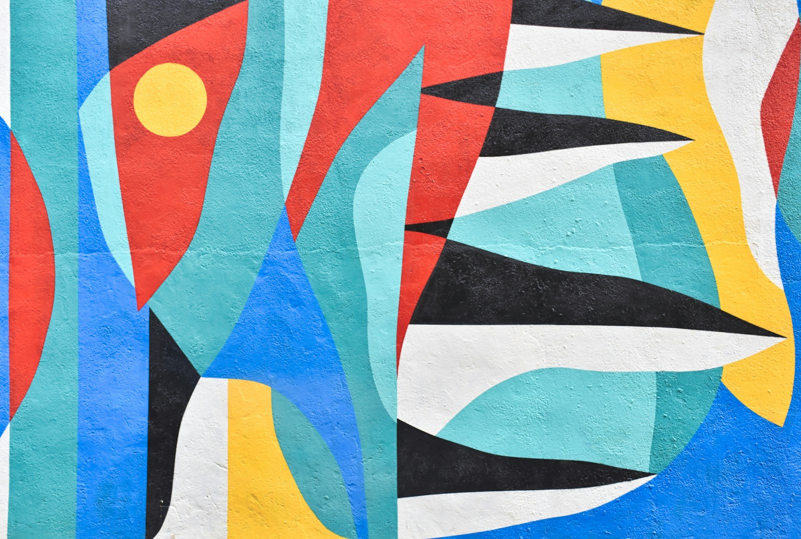
Every time you set a headline on a diagonal, cut a person out of a photo and drop them onto a flat color, or start a layout by drawing a grid, you're borrowing from a few small, loud groups of artists who worked in Europe between 1909 and 1933. Most of them disagreed with each other. Some wanted to burn down museums. One became the most famous design school in history.
This is the short version of who they were, what they made, and which of their habits ended up in your toolkit.
Futurism: the page starts moving
In 1909 the Italian poet Filippo Tommaso Marinetti published the Manifesto of Futurism on the front page of the French newspaper Le Figaro. It praised speed, machines, youth and the destruction of everything old, museums and libraries included. It was loud on purpose. Marinetti understood something brands still pay agencies to figure out: a movement needs a media strategy, not only good work.
For design, the key Futurist idea is parole in libertà, "words in freedom." Poets and artists stopped setting type in neat horizontal lines. Words grew, shrank, tilted, collided and imitated the noise of engines and explosions. The page stopped being a quiet container for text and became a place where type could perform.
Giacomo Balla painted motion and light, breaking forms into sharp diagonals to show speed. Fortunato Depero took the idea into print with Depero Futurista (1927), a book literally held together by two large bolts. It's an early case of editorial design treated as a physical object, something people who make zines and art books still chase.
There's an uncomfortable footnote. Marinetti became a supporter of Mussolini, and Futurism's love of machines and violence fed straight into Italian fascism. Worth remembering the next time a style is sold to you as "pure energy" with no politics attached.
Russian Constructivism: the diagonal gets a job
The Futurist diagonals traveled fast. After the 1917 revolution, Russian artists picked them up and gave them a very specific purpose: building the visual identity of a new socialist state. Constructivism (roughly 1915 to the early 1930s) treated art as something useful, closer to engineering than to painting.
El Lissitzky's poster Beat the Whites with the Red Wedge (1919) is the classic example. A red triangle drives into a white circle. No soldiers, no faces, no flags, and the message about the civil war is still completely clear. It proved that pure geometry could carry a political message to a mass audience.
Alexander Rodchenko and Varvara Stepanova pushed photomontage, heavy sans-serif lettering and tight, angled compositions into posters, books, textiles and advertising. If you've seen a poster with a figure shouting through a megaphone, framed by hard red and black blocks, you're looking at Constructivist grammar, usually secondhand.
The look is close to Futurism. The ideology is not. Same diagonals, very different reasons.
Dada: breaking things on purpose
In 1916, in the middle of the First World War, a group of artists who had fled to neutral Switzerland opened the Cabaret Voltaire in Zurich. Their reasoning went roughly like this: if reason, progress and national pride produced the trenches, then reason can't be trusted. Dada rejected logic, tradition, art institutions and the very idea of a "style."
Hugo Ball performed sound poems made of invented words. Tristan Tzara wrote manifestos and suggested making poems from words pulled out of a hat. Marcel Duchamp submitted a urinal signed "R. Mutt" to an exhibition in 1917 and called it Fountain, which forced a question the art world is still arguing about: who decides what counts as art?
For graphic designers, the key Dada figure is Hannah Höch. Her Cut with the Kitchen Knife Dada through the Last Weimar Beer-Belly Cultural Epoch of Germany (1919 to 1920) mixes cut-out politicians, machines, crowds and type at wildly different scales. Photomontage was a Berlin Dada technique before it became a Constructivist propaganda tool, and there's a straight line from these collages to punk flyers, 1990s magazine spreads and plenty of the collage work you scroll past today.
Whenever a designer breaks a rule on purpose to make a point, they're quoting Dada, whether they know it or not.
De Stijl: the opposite reaction
While Dada tore things apart, a group in the Netherlands went the other way. De Stijl ("The Style," 1917 to 1931) wanted a universal visual language built from as few elements as possible: horizontal and vertical lines, right angles, the three primary colors plus black, white and grey.
Piet Mondrian brought it to painting. His Composition II in Red, Blue, and Yellow (1930) is mostly white space held together by black lines and a few blocks of color, and it never feels static because the balance is asymmetric. Theo van Doesburg, the group's theorist and the editor of its magazine, carried the ideas into typography and architecture. Gerrit Rietveld built them into furniture and into the Schröder House in Utrecht (1924).
What designers kept: strict constraints can produce lively compositions, and asymmetric balance is often more interesting than symmetry. Every modular grid you've used owes something to this.
Bauhaus: turning it all into a curriculum
In 1919 the architect Walter Gropius founded the Bauhaus in Weimar, Germany. It was less a movement than a school, and that's exactly why it mattered. It took ideas floating around the avant-gardes and turned them into a way of teaching.
Every student began with the Vorkurs, a preliminary course on materials, color and form, first led by Johannes Itten and later by László Moholy-Nagy and Josef Albers. Only after that did students move into workshops: metal, weaving, furniture, wall painting, printing and advertising. The goal was to erase the old line between "fine art" and "craft," and to design things industry could actually produce.
Herbert Bayer, a former student who went on to run the printing and advertising workshop, drew a Universal alphabet in 1925 with no capital letters at all, each letter built from circles and straight lines. It never became a commercial typeface, but its logic (strip the letter down to its geometry, drop whatever doesn't help reading) shaped the sans-serifs that followed.
The school moved to Dessau in 1925 and to Berlin in 1932, and closed in 1933 under Nazi pressure. Its teachers scattered, many to the United States, which is one reason its ideas spread so widely afterward.
Surrealism: the image that shouldn't work
Surrealism grew out of Dada, but instead of destroying meaning it went looking for a different kind. André Breton's Manifesto of Surrealism (1924) argued that art should explore dreams, desire and the unconscious, with Freud as a heavy influence.
Salvador Dalí's melting clocks in The Persistence of Memory (1931) became the movement's most famous image. For designers, though, René Magritte is the more useful one. The Treachery of Images (1929) shows a pipe with the words "Ceci n'est pas une pipe" underneath. He's right: it's a painting of a pipe. That little joke is a whole lesson about how images stand in for things, the same question semiotics would formalize decades later.
Surrealism was more an art movement than a design one, but advertising has been using its tricks for a century: impossible scale, objects out of context, a familiar thing made strange so you look twice. Man Ray's experimental photography, including his cameraless "rayographs," fed directly into fashion and editorial photography.
What designers actually inherited
Put these groups side by side and you get most of the basic vocabulary of modern graphic design:
- Expressive typography. Type as image and sound, not only as text (Futurism, Dada).
- Photomontage. Cutting and recombining photos to build new meanings (Dada, Constructivism).
- Geometry as message. Abstract shapes carrying real ideas (Constructivism, De Stijl).
- The grid and asymmetric balance. Order that doesn't depend on symmetry (De Stijl, Bauhaus).
- Function-first letterforms. Sans-serifs reduced to what reading needs (Bauhaus).
- Productive strangeness. The odd image that makes you stop scrolling (Surrealism).
They also left a less comfortable lesson. None of these styles was neutral. Futurism drifted into fascism, Constructivism served a state that later turned on its own artists, and Dada existed because of a war. A style carries the arguments of the people who made it.
Try this
Pick a poster, album cover or social post you like this week and look for the pieces you can trace back to this list. Is the headline on a diagonal? Is there a cut-out photo? Is the whole thing sitting on an invisible grid? Then ask the harder question: do those choices fit what the piece is trying to say, or were they borrowed only because they look good?
Further reading
- Magdalena Droste, Bauhaus (Taschen, 1990)
- Ellen Lupton and J. Abbott Miller (eds.), The ABC's of ▲■●: The Bauhaus and Design Theory (1991)
- Philip B. Meggs and Alston W. Purvis, Meggs' History of Graphic Design (6th ed., Wiley, 2016)