Articles

Menu

→ Home

Portfolio

Services

Links

About

Iconography

August 27, 2026

8 min read

Standards and Legibility: The Numbers Behind Signs People Can Actually Read

Letter heights, mounting heights, contrast and which standard governs what, plus the wayfinding thinking that comes before any of it.

The International Symbol of Access, the white figure in a wheelchair, is probably the most regulated sign in the world. It shows up in ISO standards, in US accessibility law and in national codes everywhere. It meets every requirement. And it's still one of the most debated signs out there.

What it denotes is simple: a person in a wheelchair, geometric, static, facing front. What it connotes is harder: dependence, passivity, and only one kind of disability. That's why redesigns keep being proposed. The lesson for anyone designing signage is that meeting the standard is not the same as being done. When your project adopts a regulated symbol, it inherits the standard and the argument. A good system has to be revisable, and its manual has to say how.

Still, the numbers matter. They aren't up for negotiation with a client. But before we get to letter heights, it helps to understand what a sign is for in the first place.

Read the space before you design the sign

In The Image of the City (1960), Kevin Lynch studied Boston, Jersey City and Los Angeles and proposed a quality he called imageability: how easily people can build a mental map of a place. An imageable place can be remembered, described and sketched from memory. A place that isn't gets navigated by following instructions and forgotten on the way out. Imageability isn't beauty. An ugly place can be very legible.

Lynch named five elements people use to build those maps:

  • Paths: the channels people move along.
  • Edges: linear boundaries that aren't used as paths, like a wall, a river or rail tracks.
  • Districts: medium to large areas with a shared character that you can enter.
  • Nodes: strategic points where things meet or concentrate, which you also enter.
  • Landmarks: external reference points you don't enter, like a tower or a sculpture.

Landmarks make a place readable without a single sign. So before you add one, ask whether the building is already saying it. Signage that works supports the shape of the space. Signage that fails tries to replace it.

Paul Arthur and Romedi Passini, in Wayfinding: People, Signs, and Architecture (1992), defined wayfinding as spatial problem solving made of three processes: making decisions, carrying them out, and processing information. If a person can't make the decision, no sign will save them. You design the decision plan first, then the signs that communicate it.

That makes the decision point the basic unit of any wayfinding project: every spot where someone has to choose between two or more options. Forks, lobbies, stairs, elevator exits, and the sidewalk right before the entrance. You find them by walking the site like a first time visitor and writing down every moment of doubt, with the time, a photo and the exact question you asked yourself. Not with the floor plan in hand.

The classic mistake is putting signs where there's wall space instead of where there's a decision. That's why so many hallways are full of signs while the intersections are empty.

A project is three systems

Chris Calori and David Vanden-Eynden, in Signage and Wayfinding Design, describe signage as a pyramid of three systems:

  • Content: What it decides: What each sign says and where it goes: destination names, message hierarchy; When you decide it: While walking the site, not while drawing
  • Graphics: What it decides: How it looks: type, grid, color, pictograms, arrows; When you decide it: After content is settled
  • Hardware: What it decides: What it's made of and how it stays up: materials, mounting, lighting, maintenance; When you decide it: Early, because it decides whether the system survives three years

Most projects start with graphics, and that's why so many fail. If the content is wrong, no typeface will fix it. If the hardware is wrong, the graphics fade in a year and nobody replaces them.

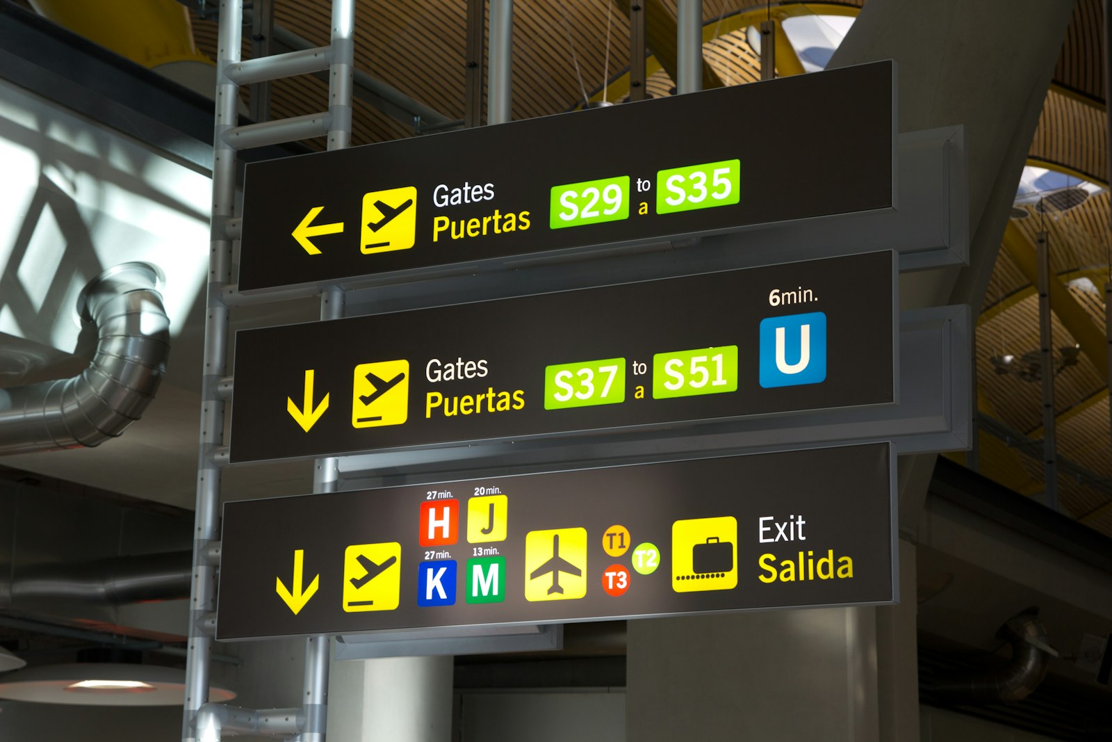
Signs also come in four types, and people meet them in roughly this order: orientation (maps and directories where you arrive), directional (a confirmation at every decision point, no more), identification (the sign that tells you you've arrived), and regulatory (it requires, prohibits or warns, and here the standard rules, not the designer). Too many directional signs are as harmful as too few.

Roland Barthes gives a useful pair of terms for how text and pictograms work together. Anchorage is the label under a pictogram choosing one meaning out of several possible readings. Relay is a sequence of signs along a route, where each one says only its piece and the full message exists only when you walk it in order. Identification signs need anchorage. Routes need relay. Confuse the two and you either repeat information until it's noise or leave people guessing.

The ISO map

These are the international standards that come up most in public signage. Each one covers its own territory:

  • ISO 7001: Registered public information symbols for places open to the public. Excludes safety and traffic signs
  • ISO 3864-1: Safety colors and design principles for safety signs
  • ISO 3864-3: Design principles for the graphical symbols used in safety signs
  • ISO 7010: Registered safety signs. Shape and color come from 3864-1, the symbol from 3864-3
  • ISO 9186: Test methods: comprehensibility, perceptual quality and symbol-referent association

A note on citing them: several of these have been amended since their current edition came out, and the amendments add signs. Writing "ISO 7010:2019" and nothing else sounds precise and is incomplete. Cite the edition and its amendments, or say you consulted the base edition. That's the difference between looking rigorous and being rigorous.

ADA section 703: two rules people constantly mix up

The 2010 ADA Standards for Accessible Design separate two kinds of characters with different measurements, because they answer different questions.

Tactile characters (section 703.2), read with the hand:

  • Character height between 5/8 inch (16 mm) and 2 inches (51 mm), measured on the uppercase I.
  • Raised, uppercase, sans serif. No italic, script or decorative styles.
  • Raised at least 1/32 inch (0.8 mm).
  • Mounted between 48 and 60 inches (1220 to 1525 mm) above the floor, with grade 2 braille below the text.
  • At doors, on the latch side, with an 18 by 18 inch (455 by 455 mm) clear floor space.

Visual characters (section 703.5), read from a distance. There's no single ratio here. There's a table indexed by mounting height and viewing distance:

  • 40 to 70 in: Viewing distance: Less than 72 in; Minimum character height: 5/8 in (16 mm)
  • 40 to 70 in: Viewing distance: 72 in or more; Minimum character height: 5/8 in, plus 1/8 in for every foot beyond 72 in
  • Over 70 to 120 in: Viewing distance: Less than 180 in; Minimum character height: 2 in (51 mm)
  • Over 70 to 120 in: Viewing distance: 180 in or more; Minimum character height: 2 in, plus 1/8 in for every foot beyond 180 in
  • Over 120 in: Viewing distance: Less than 21 ft; Minimum character height: 3 in (75 mm)
  • Over 120 in: Viewing distance: 21 ft or more; Minimum character height: 3 in, plus 1/8 in for every foot beyond 21 ft

On top of that: a non-glare finish, light characters on a dark background or the reverse, and a pictogram field at least 6 inches (150 mm) tall.

How tall should a letter be? Three sources, three answers

  • MUTCD, 11th edition (2023): At least 1 inch of letter height for every 30 feet of legibility distance. It's classed as Guidance, not a Standard: strong advice, not an obligation
  • ADA table 703.5.5: No ratio. The table above, by mounting height and distance
  • "1 inch per 25 feet": Circulates widely in the sign trade. It doesn't appear in the ADA or the MUTCD, and I couldn't trace it to a published standard

Three serious sources give three different numbers because they're answering different questions: a highway sign read at speed, dimensional letters in a lobby, and a tactile character read by hand. Your job isn't to pick "the" number. It's to say which question you're answering.

National standards: mandatory or voluntary?

International standards are only half the picture. Every country adds its own, and the first thing to check is whether a given document is actually binding.

Mexico is a good example because the naming makes the distinction visible. A NOM is a mandatory official standard. A NMX is voluntary, and only becomes binding when a NOM, a contract or a local regulation incorporates it by reference. NOM-003-SSPC-2011 sets the colors, shapes and symbols for civil protection signs (red for danger, yellow for caution, green for safe conditions, blue for obligation). NOM-026-STPS-2008 covers workplace safety colors and signs. NMX-R-050-SCFI-2006, on accessibility in public buildings, is voluntary. Briefs confuse these all the time.

Names change too. NOM-003 was born as NOM-003-SEGOB-2011 and is now NOM-003-SSPC-2011, after civil protection moved to a different federal ministry. Same content, different acronym. Cite the old one and you're citing a standard that isn't called that anymore.

And then there's the city level. Local building and accessibility regulations often add their own mounting heights and letter sizes, and they don't always agree with the national or international numbers. Check who owns the building and which rules apply before you decide.

Running a standards audit

When you review an existing site, take a sample of real signs and check each one against the same list:

  • Mounting height
  • Character height, against the viewing distance
  • Contrast between text and background
  • Finish (glare)
  • Braille and tactile characters, where required
  • Tactile floor guidance, where required

Mark each item as complies, doesn't comply or doesn't apply, and cite the specific clause every time. "Doesn't comply" without a clause isn't a finding. "Doesn't apply" needs a reason too. What makes an audit useful is that the standard you cite is the right one and the check was real, not how many clauses you managed to list.

The predictable result: mounting height is rarely right, and text-to-background contrast has almost never been measured.

One quick test before anything gets fabricated

Take one of your directional signs and give it a destination of three words. Then read it from five meters away. Whatever doesn't hold up at that distance gets fixed now, while it's still a file and not a panel bolted to a wall.

Further reading

  • Kevin Lynch, The Image of the City (1960).
  • Paul Arthur and Romedi Passini, Wayfinding: People, Signs, and Architecture (1992).
  • Chris Calori and David Vanden-Eynden, Signage and Wayfinding Design, 2nd edition (2015).
  • US Access Board, ADA Accessibility Standards, chapter 7 (Communication Elements and Features).
  • Transport for London, Legible London Yellow Book (2007).

Articles

Menu

→ Home

Portfolio

Services

Links

About

Iconography

August 27, 2026

·

8 min read

Standards and Legibility: The Numbers Behind Signs People Can Actually Read

Letter heights, mounting heights, contrast and which standard governs what, plus the wayfinding thinking that comes before any of it.

The International Symbol of Access, the white figure in a wheelchair, is probably the most regulated sign in the world. It shows up in ISO standards, in US accessibility law and in national codes everywhere. It meets every requirement. And it's still one of the most debated signs out there.

What it denotes is simple: a person in a wheelchair, geometric, static, facing front. What it connotes is harder: dependence, passivity, and only one kind of disability. That's why redesigns keep being proposed. The lesson for anyone designing signage is that meeting the standard is not the same as being done. When your project adopts a regulated symbol, it inherits the standard and the argument. A good system has to be revisable, and its manual has to say how.

Still, the numbers matter. They aren't up for negotiation with a client. But before we get to letter heights, it helps to understand what a sign is for in the first place.

Read the space before you design the sign

In The Image of the City (1960), Kevin Lynch studied Boston, Jersey City and Los Angeles and proposed a quality he called imageability: how easily people can build a mental map of a place. An imageable place can be remembered, described and sketched from memory. A place that isn't gets navigated by following instructions and forgotten on the way out. Imageability isn't beauty. An ugly place can be very legible.

Lynch named five elements people use to build those maps:

  • Paths: the channels people move along.
  • Edges: linear boundaries that aren't used as paths, like a wall, a river or rail tracks.
  • Districts: medium to large areas with a shared character that you can enter.
  • Nodes: strategic points where things meet or concentrate, which you also enter.
  • Landmarks: external reference points you don't enter, like a tower or a sculpture.

Landmarks make a place readable without a single sign. So before you add one, ask whether the building is already saying it. Signage that works supports the shape of the space. Signage that fails tries to replace it.

Paul Arthur and Romedi Passini, in Wayfinding: People, Signs, and Architecture (1992), defined wayfinding as spatial problem solving made of three processes: making decisions, carrying them out, and processing information. If a person can't make the decision, no sign will save them. You design the decision plan first, then the signs that communicate it.

That makes the decision point the basic unit of any wayfinding project: every spot where someone has to choose between two or more options. Forks, lobbies, stairs, elevator exits, and the sidewalk right before the entrance. You find them by walking the site like a first time visitor and writing down every moment of doubt, with the time, a photo and the exact question you asked yourself. Not with the floor plan in hand.

The classic mistake is putting signs where there's wall space instead of where there's a decision. That's why so many hallways are full of signs while the intersections are empty.

A project is three systems

Chris Calori and David Vanden-Eynden, in Signage and Wayfinding Design, describe signage as a pyramid of three systems:

  • Content: What it decides: What each sign says and where it goes: destination names, message hierarchy; When you decide it: While walking the site, not while drawing
  • Graphics: What it decides: How it looks: type, grid, color, pictograms, arrows; When you decide it: After content is settled
  • Hardware: What it decides: What it's made of and how it stays up: materials, mounting, lighting, maintenance; When you decide it: Early, because it decides whether the system survives three years

Most projects start with graphics, and that's why so many fail. If the content is wrong, no typeface will fix it. If the hardware is wrong, the graphics fade in a year and nobody replaces them.

Signs also come in four types, and people meet them in roughly this order: orientation (maps and directories where you arrive), directional (a confirmation at every decision point, no more), identification (the sign that tells you you've arrived), and regulatory (it requires, prohibits or warns, and here the standard rules, not the designer). Too many directional signs are as harmful as too few.

Roland Barthes gives a useful pair of terms for how text and pictograms work together. Anchorage is the label under a pictogram choosing one meaning out of several possible readings. Relay is a sequence of signs along a route, where each one says only its piece and the full message exists only when you walk it in order. Identification signs need anchorage. Routes need relay. Confuse the two and you either repeat information until it's noise or leave people guessing.

The ISO map

These are the international standards that come up most in public signage. Each one covers its own territory:

  • ISO 7001: Registered public information symbols for places open to the public. Excludes safety and traffic signs
  • ISO 3864-1: Safety colors and design principles for safety signs
  • ISO 3864-3: Design principles for the graphical symbols used in safety signs
  • ISO 7010: Registered safety signs. Shape and color come from 3864-1, the symbol from 3864-3
  • ISO 9186: Test methods: comprehensibility, perceptual quality and symbol-referent association

A note on citing them: several of these have been amended since their current edition came out, and the amendments add signs. Writing "ISO 7010:2019" and nothing else sounds precise and is incomplete. Cite the edition and its amendments, or say you consulted the base edition. That's the difference between looking rigorous and being rigorous.

ADA section 703: two rules people constantly mix up

The 2010 ADA Standards for Accessible Design separate two kinds of characters with different measurements, because they answer different questions.

Tactile characters (section 703.2), read with the hand:

  • Character height between 5/8 inch (16 mm) and 2 inches (51 mm), measured on the uppercase I.
  • Raised, uppercase, sans serif. No italic, script or decorative styles.
  • Raised at least 1/32 inch (0.8 mm).
  • Mounted between 48 and 60 inches (1220 to 1525 mm) above the floor, with grade 2 braille below the text.
  • At doors, on the latch side, with an 18 by 18 inch (455 by 455 mm) clear floor space.

Visual characters (section 703.5), read from a distance. There's no single ratio here. There's a table indexed by mounting height and viewing distance:

  • 40 to 70 in: Viewing distance: Less than 72 in; Minimum character height: 5/8 in (16 mm)
  • 40 to 70 in: Viewing distance: 72 in or more; Minimum character height: 5/8 in, plus 1/8 in for every foot beyond 72 in
  • Over 70 to 120 in: Viewing distance: Less than 180 in; Minimum character height: 2 in (51 mm)
  • Over 70 to 120 in: Viewing distance: 180 in or more; Minimum character height: 2 in, plus 1/8 in for every foot beyond 180 in
  • Over 120 in: Viewing distance: Less than 21 ft; Minimum character height: 3 in (75 mm)
  • Over 120 in: Viewing distance: 21 ft or more; Minimum character height: 3 in, plus 1/8 in for every foot beyond 21 ft

On top of that: a non-glare finish, light characters on a dark background or the reverse, and a pictogram field at least 6 inches (150 mm) tall.

How tall should a letter be? Three sources, three answers

  • MUTCD, 11th edition (2023): At least 1 inch of letter height for every 30 feet of legibility distance. It's classed as Guidance, not a Standard: strong advice, not an obligation
  • ADA table 703.5.5: No ratio. The table above, by mounting height and distance
  • "1 inch per 25 feet": Circulates widely in the sign trade. It doesn't appear in the ADA or the MUTCD, and I couldn't trace it to a published standard

Three serious sources give three different numbers because they're answering different questions: a highway sign read at speed, dimensional letters in a lobby, and a tactile character read by hand. Your job isn't to pick "the" number. It's to say which question you're answering.

National standards: mandatory or voluntary?

International standards are only half the picture. Every country adds its own, and the first thing to check is whether a given document is actually binding.

Mexico is a good example because the naming makes the distinction visible. A NOM is a mandatory official standard. A NMX is voluntary, and only becomes binding when a NOM, a contract or a local regulation incorporates it by reference. NOM-003-SSPC-2011 sets the colors, shapes and symbols for civil protection signs (red for danger, yellow for caution, green for safe conditions, blue for obligation). NOM-026-STPS-2008 covers workplace safety colors and signs. NMX-R-050-SCFI-2006, on accessibility in public buildings, is voluntary. Briefs confuse these all the time.

Names change too. NOM-003 was born as NOM-003-SEGOB-2011 and is now NOM-003-SSPC-2011, after civil protection moved to a different federal ministry. Same content, different acronym. Cite the old one and you're citing a standard that isn't called that anymore.

And then there's the city level. Local building and accessibility regulations often add their own mounting heights and letter sizes, and they don't always agree with the national or international numbers. Check who owns the building and which rules apply before you decide.

Running a standards audit

When you review an existing site, take a sample of real signs and check each one against the same list:

  • Mounting height
  • Character height, against the viewing distance
  • Contrast between text and background
  • Finish (glare)
  • Braille and tactile characters, where required
  • Tactile floor guidance, where required

Mark each item as complies, doesn't comply or doesn't apply, and cite the specific clause every time. "Doesn't comply" without a clause isn't a finding. "Doesn't apply" needs a reason too. What makes an audit useful is that the standard you cite is the right one and the check was real, not how many clauses you managed to list.

The predictable result: mounting height is rarely right, and text-to-background contrast has almost never been measured.

One quick test before anything gets fabricated

Take one of your directional signs and give it a destination of three words. Then read it from five meters away. Whatever doesn't hold up at that distance gets fixed now, while it's still a file and not a panel bolted to a wall.

Further reading

  • Kevin Lynch, The Image of the City (1960).
  • Paul Arthur and Romedi Passini, Wayfinding: People, Signs, and Architecture (1992).
  • Chris Calori and David Vanden-Eynden, Signage and Wayfinding Design, 2nd edition (2015).
  • US Access Board, ADA Accessibility Standards, chapter 7 (Communication Elements and Features).
  • Transport for London, Legible London Yellow Book (2007).

Iconography

August 27, 2026

·

8 min read

Standards and Legibility: The Numbers Behind Signs People Can Actually Read

Letter heights, mounting heights, contrast and which standard governs what, plus the wayfinding thinking that comes before any of it.

The International Symbol of Access, the white figure in a wheelchair, is probably the most regulated sign in the world. It shows up in ISO standards, in US accessibility law and in national codes everywhere. It meets every requirement. And it's still one of the most debated signs out there.

What it denotes is simple: a person in a wheelchair, geometric, static, facing front. What it connotes is harder: dependence, passivity, and only one kind of disability. That's why redesigns keep being proposed. The lesson for anyone designing signage is that meeting the standard is not the same as being done. When your project adopts a regulated symbol, it inherits the standard and the argument. A good system has to be revisable, and its manual has to say how.

Still, the numbers matter. They aren't up for negotiation with a client. But before we get to letter heights, it helps to understand what a sign is for in the first place.

Read the space before you design the sign

In The Image of the City (1960), Kevin Lynch studied Boston, Jersey City and Los Angeles and proposed a quality he called imageability: how easily people can build a mental map of a place. An imageable place can be remembered, described and sketched from memory. A place that isn't gets navigated by following instructions and forgotten on the way out. Imageability isn't beauty. An ugly place can be very legible.

Lynch named five elements people use to build those maps:

  • Paths: the channels people move along.
  • Edges: linear boundaries that aren't used as paths, like a wall, a river or rail tracks.
  • Districts: medium to large areas with a shared character that you can enter.
  • Nodes: strategic points where things meet or concentrate, which you also enter.
  • Landmarks: external reference points you don't enter, like a tower or a sculpture.

Landmarks make a place readable without a single sign. So before you add one, ask whether the building is already saying it. Signage that works supports the shape of the space. Signage that fails tries to replace it.

Paul Arthur and Romedi Passini, in Wayfinding: People, Signs, and Architecture (1992), defined wayfinding as spatial problem solving made of three processes: making decisions, carrying them out, and processing information. If a person can't make the decision, no sign will save them. You design the decision plan first, then the signs that communicate it.

That makes the decision point the basic unit of any wayfinding project: every spot where someone has to choose between two or more options. Forks, lobbies, stairs, elevator exits, and the sidewalk right before the entrance. You find them by walking the site like a first time visitor and writing down every moment of doubt, with the time, a photo and the exact question you asked yourself. Not with the floor plan in hand.

The classic mistake is putting signs where there's wall space instead of where there's a decision. That's why so many hallways are full of signs while the intersections are empty.

A project is three systems

Chris Calori and David Vanden-Eynden, in Signage and Wayfinding Design, describe signage as a pyramid of three systems:

  • Content: What it decides: What each sign says and where it goes: destination names, message hierarchy; When you decide it: While walking the site, not while drawing
  • Graphics: What it decides: How it looks: type, grid, color, pictograms, arrows; When you decide it: After content is settled
  • Hardware: What it decides: What it's made of and how it stays up: materials, mounting, lighting, maintenance; When you decide it: Early, because it decides whether the system survives three years

Most projects start with graphics, and that's why so many fail. If the content is wrong, no typeface will fix it. If the hardware is wrong, the graphics fade in a year and nobody replaces them.

Signs also come in four types, and people meet them in roughly this order: orientation (maps and directories where you arrive), directional (a confirmation at every decision point, no more), identification (the sign that tells you you've arrived), and regulatory (it requires, prohibits or warns, and here the standard rules, not the designer). Too many directional signs are as harmful as too few.

Roland Barthes gives a useful pair of terms for how text and pictograms work together. Anchorage is the label under a pictogram choosing one meaning out of several possible readings. Relay is a sequence of signs along a route, where each one says only its piece and the full message exists only when you walk it in order. Identification signs need anchorage. Routes need relay. Confuse the two and you either repeat information until it's noise or leave people guessing.

The ISO map

These are the international standards that come up most in public signage. Each one covers its own territory:

  • ISO 7001: Registered public information symbols for places open to the public. Excludes safety and traffic signs
  • ISO 3864-1: Safety colors and design principles for safety signs
  • ISO 3864-3: Design principles for the graphical symbols used in safety signs
  • ISO 7010: Registered safety signs. Shape and color come from 3864-1, the symbol from 3864-3
  • ISO 9186: Test methods: comprehensibility, perceptual quality and symbol-referent association

A note on citing them: several of these have been amended since their current edition came out, and the amendments add signs. Writing "ISO 7010:2019" and nothing else sounds precise and is incomplete. Cite the edition and its amendments, or say you consulted the base edition. That's the difference between looking rigorous and being rigorous.

ADA section 703: two rules people constantly mix up

The 2010 ADA Standards for Accessible Design separate two kinds of characters with different measurements, because they answer different questions.

Tactile characters (section 703.2), read with the hand:

  • Character height between 5/8 inch (16 mm) and 2 inches (51 mm), measured on the uppercase I.
  • Raised, uppercase, sans serif. No italic, script or decorative styles.
  • Raised at least 1/32 inch (0.8 mm).
  • Mounted between 48 and 60 inches (1220 to 1525 mm) above the floor, with grade 2 braille below the text.
  • At doors, on the latch side, with an 18 by 18 inch (455 by 455 mm) clear floor space.

Visual characters (section 703.5), read from a distance. There's no single ratio here. There's a table indexed by mounting height and viewing distance:

  • 40 to 70 in: Viewing distance: Less than 72 in; Minimum character height: 5/8 in (16 mm)
  • 40 to 70 in: Viewing distance: 72 in or more; Minimum character height: 5/8 in, plus 1/8 in for every foot beyond 72 in
  • Over 70 to 120 in: Viewing distance: Less than 180 in; Minimum character height: 2 in (51 mm)
  • Over 70 to 120 in: Viewing distance: 180 in or more; Minimum character height: 2 in, plus 1/8 in for every foot beyond 180 in
  • Over 120 in: Viewing distance: Less than 21 ft; Minimum character height: 3 in (75 mm)
  • Over 120 in: Viewing distance: 21 ft or more; Minimum character height: 3 in, plus 1/8 in for every foot beyond 21 ft

On top of that: a non-glare finish, light characters on a dark background or the reverse, and a pictogram field at least 6 inches (150 mm) tall.

How tall should a letter be? Three sources, three answers

  • MUTCD, 11th edition (2023): At least 1 inch of letter height for every 30 feet of legibility distance. It's classed as Guidance, not a Standard: strong advice, not an obligation
  • ADA table 703.5.5: No ratio. The table above, by mounting height and distance
  • "1 inch per 25 feet": Circulates widely in the sign trade. It doesn't appear in the ADA or the MUTCD, and I couldn't trace it to a published standard

Three serious sources give three different numbers because they're answering different questions: a highway sign read at speed, dimensional letters in a lobby, and a tactile character read by hand. Your job isn't to pick "the" number. It's to say which question you're answering.

National standards: mandatory or voluntary?

International standards are only half the picture. Every country adds its own, and the first thing to check is whether a given document is actually binding.

Mexico is a good example because the naming makes the distinction visible. A NOM is a mandatory official standard. A NMX is voluntary, and only becomes binding when a NOM, a contract or a local regulation incorporates it by reference. NOM-003-SSPC-2011 sets the colors, shapes and symbols for civil protection signs (red for danger, yellow for caution, green for safe conditions, blue for obligation). NOM-026-STPS-2008 covers workplace safety colors and signs. NMX-R-050-SCFI-2006, on accessibility in public buildings, is voluntary. Briefs confuse these all the time.

Names change too. NOM-003 was born as NOM-003-SEGOB-2011 and is now NOM-003-SSPC-2011, after civil protection moved to a different federal ministry. Same content, different acronym. Cite the old one and you're citing a standard that isn't called that anymore.

And then there's the city level. Local building and accessibility regulations often add their own mounting heights and letter sizes, and they don't always agree with the national or international numbers. Check who owns the building and which rules apply before you decide.

Running a standards audit

When you review an existing site, take a sample of real signs and check each one against the same list:

  • Mounting height
  • Character height, against the viewing distance
  • Contrast between text and background
  • Finish (glare)
  • Braille and tactile characters, where required
  • Tactile floor guidance, where required

Mark each item as complies, doesn't comply or doesn't apply, and cite the specific clause every time. "Doesn't comply" without a clause isn't a finding. "Doesn't apply" needs a reason too. What makes an audit useful is that the standard you cite is the right one and the check was real, not how many clauses you managed to list.

The predictable result: mounting height is rarely right, and text-to-background contrast has almost never been measured.

One quick test before anything gets fabricated

Take one of your directional signs and give it a destination of three words. Then read it from five meters away. Whatever doesn't hold up at that distance gets fixed now, while it's still a file and not a panel bolted to a wall.

Further reading

  • Kevin Lynch, The Image of the City (1960).
  • Paul Arthur and Romedi Passini, Wayfinding: People, Signs, and Architecture (1992).
  • Chris Calori and David Vanden-Eynden, Signage and Wayfinding Design, 2nd edition (2015).
  • US Access Board, ADA Accessibility Standards, chapter 7 (Communication Elements and Features).
  • Transport for London, Legible London Yellow Book (2007).