
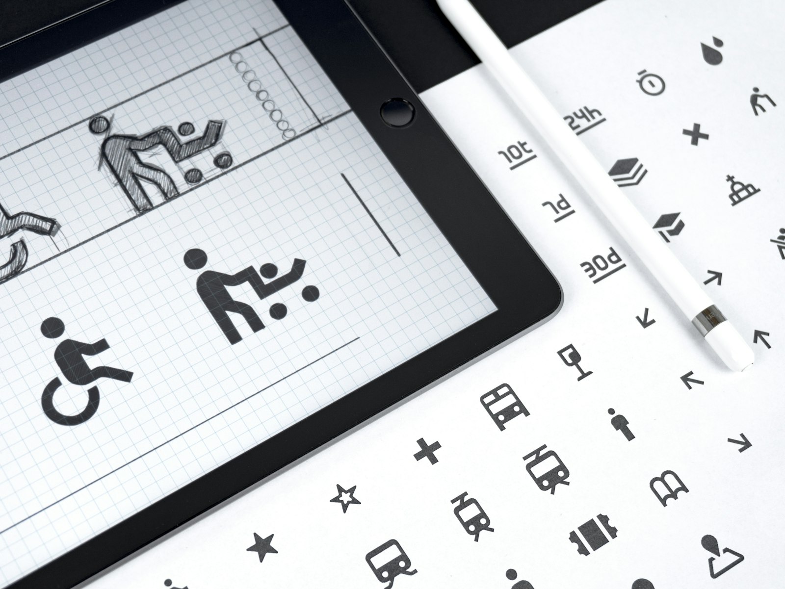
Around four thousand pictograms, cut by hand over roughly twenty years, with several people involved. And they still look like one set. How does that happen?
It isn't talent, or at least not only talent. It's that nobody on the team was deciding things on their own. The rules were deciding. That idea, more than any single drawing, is what Isotype left us, and it's the reason it still matters to anyone designing an icon family today.
Three people, one method
Isotype stands for International System of Typographic Picture Education. The name came around 1935, when the system had already been working for about a decade.
- Otto Neurath: Years: 1882 to 1945; Role: Philosopher and economist. Founded Vienna's Social and Economic Museum (Gesellschafts- und Wirtschaftsmuseum) in 1925
- Marie Reidemeister, later Marie Neurath: Years: 1898 to 1986; Role: The "transformer" who turned data into pictures. Credited with the name Isotype. Ran the Isotype Institute after Otto's death and kept the work going for decades
- Gerd Arntz: Years: 1900 to 1988; Role: The artist. Joined the museum in 1928 and designed around 4,000 signs, originally cut as linocuts
The short version of the timeline: Vienna in 1925, The Hague after the museum was shut down in 1934, and England from 1940, where the Isotype Institute was set up in Oxford.
History has a habit of calling Isotype "Otto Neurath's system". When you read about it, notice how often Marie disappears from the story. She shouldn't.
A museum that collected nothing
The Vienna museum didn't exhibit objects. It exhibited relationships: housing, wages, mortality, migration.
- Who it was for: working people in Vienna, many with only a few years of school. The museum went out to the housing estates instead of waiting for visitors.
- What it was against: the table of figures, which you can only read if you already know how.
- What it used: a closed vocabulary of signs, plus rules that anyone on the team could apply the same way.
That brief will sound familiar to anyone designing signage or an icon set: an audience that doesn't know you, and a vocabulary that has to hold up when you're not in the room to explain it.
"Words divide, pictures unite"
That was Neurath's slogan. Behind it is a political bet: public information should be readable by people who don't read well, not only by people who already know.
It's worth treating as a slogan, not a finding. Pictures only unite when they've been tested. One 2022 study of pharmaceutical pictograms found that only 17 out of 108 reached the comprehension criterion researchers were using. Good intentions are not the same as understanding.
The three rules
None of the three rules is about how a sign looks. All three are about how it's read. That's why they still work almost a century later.
1. Show quantity by repeating, not enlarging
A bigger number isn't shown with a bigger pictogram. It's shown with more pictograms of the same size.
The eye counts units well and estimates areas badly. Double a figure's height and width and it looks four times bigger, not twice. Every inflated-icon infographic you've seen breaks this rule.
2. No perspective
Objects of the same size look bigger or smaller depending on how far away they are. Perspective is pleasant, and it lies about the data.
For an icon set, this translates into one consistent point of view. Everything front-on, or everything in profile. One figure in three-quarter view breaks the set, even if it's the best drawing in it. This is the rule that hurts most, because the sketch with perspective is almost always the prettiest one.
3. Keep only what's essential
Emphasize the essential features, drop the accessory ones. The result has to be easy to recognize, and just as important, easy to tell apart from the other signs in the set.
Those two halves pull against each other. The more you simplify, the more your signs start to resemble each other. The balance point is different for every set, and the only way to find it is by testing.
The transformation
Marie Neurath described her job as extracting the essential facts from data given in words and figures, and putting them into picture form. First you decide what you're saying. Then someone draws it.
As a process, it looks like this:
- Read the data.
- Write the fact in one sentence.
- Decide the unit (what does one figure stand for?).
- Only then, draw.
That role is the ancestor of the modern information designer. And it applies well beyond charts: deciding what makes a thing recognizable is a content decision before it's a drawing decision.
The archive, and a warning
If you want to study Isotype properly, there are two places to go:
- The University of Reading holds the Isotype Collection, donated by Marie Neurath in 1971: correspondence, charts, printing plates, films. It's where you go to see process.
- The Gerd Arntz Web Archive has the pictograms scanned from original prints, browsable by category. It's where you go to see form.
But they aren't free to use. The Arntz archive states clearly that the images can't be used without permission from the rights holders. Use them as reference. Don't trace them.
Applying the method to your own set
Isotype's lesson for anyone building an icon family is simple to say and hard to practice: a system without rules is just a folder of drawings. The constraint doesn't limit the drawing. It's what makes the drawing possible.
Here's how that turns into working habits.
Write three rules before you draw. One line each. "All figures in profile." "One stroke weight, no fills." "Only straight lines and 45 degree angles." If you can't write them, you don't have a system yet.
Choose between sketches with criteria, in order. When you have many sketches of the same subject and need to pick one:
- It reads in silhouette. Cover the interior details with your finger. If you can't tell what it is anymore, the details won't save it.
- It's distinct from its siblings. Don't compare it to the reference photo. Compare it to the other icons in the set.
- It survives small sizes. If its thinnest feature is thinner than your base stroke, that feature won't make it.
Defend each pick in one line. A useful template: "I chose this version because ___ is what makes it recognizable in silhouette, and I dropped ___ so that could read." For example: "I chose this giraffe because the angled neck is what separates it from a horse, and I dropped the spots so the neck line wouldn't compete." Answers that don't count: "it came out best" and "it looks most like the photo". Resemblance isn't the criterion.
Do the lineup test. Put the whole set in a row, same size, same weight. Look at stroke, scale, point of view and level of detail. If it looks like several authors drew it, it isn't a system yet. It's a group of drawings.
Derive weights, don't invent them. If your set needs light, regular and filled versions, borrow the numbers from a typeface: measure the stem of the light, regular and bold weights and use those as stroke thicknesses. A filled version isn't the outline with the paint bucket applied; it gets redrawn, deciding which inner holes survive, and it should feel as heavy as the bold weight of the same typeface next to it. If you add a two-tone variant, fix the second value and the zone it goes on once, and apply it the same way everywhere.
Three mistakes you can spot from a meter away, and they all share a root:
- Stroke weight by eye. It looks right in one icon and wrong in the others, because no number ties them together.
- Scaling instead of redrawing. Large sizes have too much detail, small sizes too little. Each size needs its own review.
- Mixing weights on one sheet. You end up comparing taste instead of weights.
Every one of them is a decision made by looking at the screen instead of at the rules.
Try this
Find one statistic from your city, your school or your job. Write the essential fact in a single sentence. Decide what one figure stands for. Then draw it as an Isotype chart by hand. Afterwards, find an infographic published this week and look for the rule it breaks. It usually takes less than a minute.
Further reading
- Michael Twyman, "The significance of Isotype" (1975), republished on Isotype Revisited, University of Reading.
- Otto Neurath, International Picture Language (1936).
- Isotype Revisited, University of Reading (project website).
- Gerd Arntz Web Archive (gerdarntz.org).