
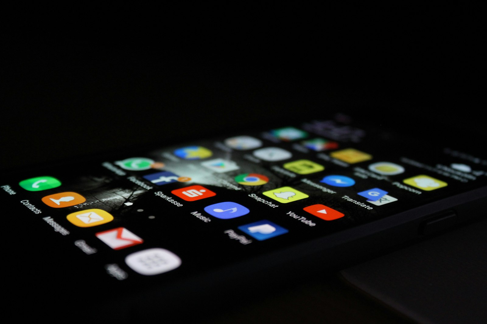
A 24 pixel icon on your phone isn't 24 pixels. It's probably 72. And the file you exported from your design tool might look sharp on your monitor and blurry on someone else's, for reasons that have nothing to do with how well you drew it.
Icons in public space solve a literacy problem: a stranger has to read them without help. Icons in an interface have that problem too, plus a few more that a street sign never had to worry about. Pixels, sizes, themes and code. This is a tour of those constraints, and of how three of the biggest design systems deal with them.
Pixels that aren't pixels
Android and Material Design measure in dp, density-independent pixels. A dp isn't a physical pixel. On a low density screen, 1 dp equals 1 pixel. On a phone that packs three times as many pixels into the same centimeter, 1 dp equals 3 pixels.
The point is that a 24 dp icon looks the same physical size on every screen, even though it uses a different number of pixels on each. So when Material says "24 dp", read it as "24 units of apparent size".
IBM's Carbon system, on the other hand, talks in real pixels, because it designs for the screen and snaps everything to whole values. In practice the numbers line up. The logic behind them doesn't, and it's worth knowing which one you're working in.
Dark mode is not "invert the colors"
Dark mode is a second palette, declared on purpose, with its own backgrounds and its own contrast math. An icon that passes a 3:1 contrast ratio on white may fail on dark gray.
So measure contrast in both modes, not just the one you designed in. For icons that stand alone without text, the accessibility benchmark is WCAG's 3:1 for non-text content. Some systems ask for more: Carbon asks icons to meet the same 4.5:1 as text.
Expanded strokes and whole pixels
Two technical requirements show up in almost every icon production guide, and they're rarely explained.
Expand your strokes. A live stroke is a line with a thickness applied on top. If someone scales the file, that thickness can change or break. Expanding the stroke turns it into a fill: a closed shape with the thickness baked into the geometry. In Figma it's called Outline stroke. After you expand, what you see is what's there.
No decimals in coordinates. If an edge lands at x = 12.5, it covers half a pixel, and the renderer averages it with its neighbor. The line comes out gray and fuzzy. Carbon's contribution guidelines are blunt about this: no decimal values in coordinates, width or height, and never center-aligned strokes, because centering creates half pixels.
Material: the 24 unit standard
Most of the industry still works from numbers first published in the original Material Design icon guidelines (Material 1):
- System icons display at 24 dp.
- The live area is 20 by 20 dp, with 2 dp of padding all around.
- There's a dense 20 dp variant for desktop, with a 16 by 16 live area.
- Stroke weight is a consistent 2 dp, including curves, angles, and inside and outside strokes. Terminals are square.
One detail worth copying: the guideline documents its own exception. The paperclip icon uses a 1.5 dp stroke instead of 2 dp to fit several curves. Documenting the exception is part of the system.
A caution when you cite these numbers: they come from the archived Material 1 site. The current documentation is Material 3, which doesn't publish them in the same format. Cite them as the legacy Material spec that's still in wide use, not as Google's current guidance.
Material Symbols: the icon as a variable font
Google's Material Symbols ship as variable fonts with four axes, which means one file covers a whole range of looks:
- opsz (optical size): Range: 20 to 48, default 24; What it does: Adjusts the drawing for the size it's shown at
- wght (weight): Range: 100 to 700; What it does: Stroke thickness. Comes in three styles: Outlined, Rounded and Sharp
- FILL: Range: 0 to 1; What it does: There's no separate "filled" set. Fill is an axis
- GRAD (grade): Range: Negative to positive values; What it does: Fine weight adjustment. A negative grade helps with light icons on dark backgrounds, where strokes tend to look heavier
A small lesson from working with these: the prose documentation and the actual font file don't always agree on the ranges. When precision matters, check the font itself.
Carbon: four sizes, one source of truth
IBM draws its icons on a 32 by 32 pixel grid and scales them down linearly. Components typically use 16 pixel icons, and the 16 and 20 pixel sizes are tuned to sit next to IBM Plex at 14 and 16 pixels.
What makes Carbon worth studying is that everything scales together. At 32 pixels, stroke, margin and corner radius are all 2 pixels. At 16 pixels, they're all 1. There's no guessing at in-between sizes because the table already answers it.
Carbon also asks for touch targets of 44 pixels or more on interactive icons, which matches WCAG's enhanced target size level.
Apple: the symbol as typography
Apple's SF Symbols take a different angle. Instead of treating icons as little illustrations, they treat them as part of the type system:
- Weights: nine symbol weights, each one matching a weight of the San Francisco typeface, from ultralight to black. The goal is that a symbol sitting next to text has the same weight as that text.
- Scales: small, medium and large, defined relative to San Francisco's cap height rather than as fixed pixel sizes.
- Rendering modes: monochrome, hierarchical, palette and multicolor. Some symbols get intrinsic colors to reinforce meaning.
Apple's library counts thousands of symbols and keeps growing every year. If you cite a number, take it from Apple's current SF Symbols page and note the version.
Align to the text, or to the baseline?
Here the big systems disagree:
- Apple matches weights, sizes symbols relative to cap height, and uses negative side margins so symbols align optically with text.
- Carbon says to center icons vertically when they sit next to text, and explicitly does not align them to the baseline.
Neither one is wrong. Pick one and write it into your spec. What breaks a system isn't having the wrong rule. It's not having one.
Scaling is not redrawing
GitHub's Primer guidelines for Octicons say it without softening: design two versions, one at 16 pixels and one at 24. What's a detail at 24 is a smudge at 16.
This is the most common shortcut in icon work and the one that shows most. If your set has to live at more than one size, the small size gets its own drawing, with fewer interior lines, wider gaps and simpler joins.
A spec is only as good as a stranger's first attempt
All of these decisions (unit, live area, stroke, terminals, alignment, sizes, modes) belong in one written specification. And there's a simple way to find out whether yours is complete.
Give your spec to another designer and ask them to draw one simple icon with it, without asking you anything. Every question they have is a hole in your document. Fix those, and try it again with someone else.
Further reading
- Material Design (Material 1 archive), "Icons", system icon guidelines.
- Material Design 3, "Designing icons".
- IBM Design Language, "UI icons: usage" and Carbon Design System, "Icons".
- Apple Human Interface Guidelines, "SF Symbols".
- GitHub Primer, "Octicons design guidelines".
- Figma Config 2023, "We Drew 30,000 Icons in Figma and So Can You" (talk).