Articles

Menu

→ Home

Portfolio

Services

Links

About

Design history

May 31, 2026

7 min read

Design History in Three Cultural Eras, Part 3: Postmodern Graphic Design and the Digital Age

Psychedelic posters, punk, Memphis, David Carson, Emigre, pixel art and vaporwave: how postmodern doubt became the look of modern media.

Modernist designers spent decades arguing that the best typography is invisible and the best layout gets out of the way. Then, starting in the 1960s, a lot of very talented people made work that was hard to read on purpose, and it worked. How did "illegible" become a legitimate design choice?

This is the last part of a three-part series. Part 1: Before Modernism covered the premodern era, when truth came from God and tradition. Part 2: Modernism and the Birth of Postmodern Thought followed the faith in reason and progress, and the postmodern doubt that replaced it. Here we take that doubt into actual graphic design: posters, record sleeves, magazines, typefaces and, eventually, screens.

Psychedelia (roughly 1965 to 1972, San Francisco)

The center was San Francisco around 1967: the hippie movement, the Vietnam War and LSD in the counterculture. A group of artists started making concert posters for venues like the Fillmore and the Avalon Ballroom that were, by design, hard to read.

That was the point. If you weren't part of the scene, the poster wasn't talking to you. It may be the first design movement where subjective experience clearly mattered more than clear communication. The visual traits:

  • Lettering that seems to melt or vibrate, filling every inch of the shape it sits in
  • Hypersaturated, clashing colors chosen to make your eyes buzz
  • Organic forms, spirals, mandalas and optical effects
  • Art Nouveau, Surrealism and pop culture mixed freely, with no hierarchy

Wes Wilson and Victor Moscoso are the names to know. The same scene fed Zap Comix (first issue 1968, final issue 2014), where R. Crumb, Moscoso, Rick Griffin, S. Clay Wilson and others built the look of underground comics.

Punk (late 1970s, UK and US)

If psychedelia was illegible because of a trance, punk was illegible because of rage. Do it yourself, and reject professional polish. Letters cut from newspapers like a ransom note, cheap photocopies, typewriter type. Ugly was honest; polished was a corporate lie.

The key designer is Jamie Reid, whose work for the Sex Pistols (God Save the Queen, 1977, and Never Mind the Bollocks) defined the look.

New Wave and post-punk (late 1970s and 1980s, UK)

The grown-up version of punk. It brought back modernist structure (grids, Swiss-style type) and used it with ironic distance. Clean geometry, bright color on dark backgrounds, and borrowed references to De Stijl, Futurism and the Bauhaus, now dressed up for rock bands. Record sleeves became conceptual design objects.

Peter Saville is the defining figure, with his work for Factory Records, Joy Division's Unknown Pleasures (1979) and New Order's Power, Corruption & Lies (1983).

The rebellion inside the design schools

While punks attacked design from the outside, some teachers attacked it from within.

Wolfgang Weingart, teaching at the Basel School of Design (the heart of the Swiss Style) from 1968, pushed metal type to its limits: stepped and layered compositions, overlapping screens, type as texture. He took the Swiss grid seriously enough to break it with intent, and he taught a generation that included April Greiman and Dan Friedman.

April Greiman carried that energy to California and to the computer. She was among the first designers to adopt the Apple Macintosh (released in 1984) as a serious design tool, mixing photography, video stills, type and visible pixels. Her issue of Design Quarterly 133 (1986) folded out into a life-size, digitally assembled nude self-portrait poster. She's the bridge between Basel and the digital revolution.

Memphis (1981 to 1988, Milan)

In Italy, a collective went further and rejected the very idea of "good design." Memphis, led by Ettore Sottsass, launched in 1981 with furniture and objects in loud colors, cheap plastic laminates, clashing patterns and toy-like shapes. It freed furniture, product and graphic design from strict functionalism. David Bowie was a serious collector. If 1980s TV graphics come to mind when you hear "Memphis," that's no accident.

Camp and kitsch

Postmodernism rehabilitated two categories modernism despised:

  • Kitsch: the commercial, the sentimental, what elites dismissed as cheap or tasteless.
  • Camp: the ironic, self-aware embrace of the "awful" until it becomes art, so bad it's good.

The key text is Susan Sontag's essay Notes on "Camp" (1964). The creative tools here are irony, a real appreciation of popular and commercial culture, and excess.

The 1990s: legibility becomes optional

The 1990s radicalized all of this. The defining figure is David Carson, art director of Beach Culture and then Ray Gun. He came to design late, from teaching and professional surfing, with little formal training, and treated type as image rather than text. The most repeated story: he set an entire Ray Gun interview with Bryan Ferry in Zapf Dingbats, a symbol font, because he found it boring. Legibility became a choice, not a rule.

Around him, a whole wave of experimental work: Neville Brody (The Face, Arena, and co-founder of FontShop), Vaughan Oliver (the visual identity of 4AD Records, for bands like Pixies and Cocteau Twins), and The Designers Republic in Sheffield (Warp Records, Aphex Twin, the Wipeout video game). Dirty textures, distorted type and heavy layering became a style, sometimes called grunge, in parallel with the music.

The tools change everything

None of that 1990s work happens without the software. The key dates:

  • 1984: Apple Macintosh, the first commercially successful computer with a graphical interface
  • 1987: Adobe Illustrator and QuarkXPress
  • 1990: Adobe Photoshop
  • 1999: Adobe InDesign, which eventually displaced Quark

The tools you have shape what you can make. Once you didn't need a print shop to experiment, styles multiplied, amateur design exploded, and new forms (digital collage, layered type, generative images) became possible.

Emigre (1984 to 2005), the magazine and type foundry run by Zuzana Licko and Rudy VanderLans, is the emblem of the moment. It published digital typefaces by independent designers long before the web made that easy, including Licko's own Base, Mrs Eaves and Filosofia.

Digital-native aesthetics

From here, the story moves onto screens, and new styles grow out of the machines themselves.

Algorithmic art

In the 1960s and 1970s, artists like Frieder Nake, Georg Nees, Vera Molnár and Harold Cohen used mainframes and plotters to generate images from code. It's one of the first times mathematics was used programmatically to make visual work. In the 1980s, Benoit Mandelbrot's fractal geometry, patterns that repeat at every scale, became a popular aesthetic in its own right.

ASCII art and emoticons

Pictures made from text characters go back to the early days of computing, printed on teletypes and line printers before screens were common. In the 1980s, bulletin board systems (BBS, the online communities before the web) spread text art widely. In 1982, Scott Fahlman proposed :-) to mark jokes on a university message board. Emoticons are the direct ancestors of emoji.

Pixel art

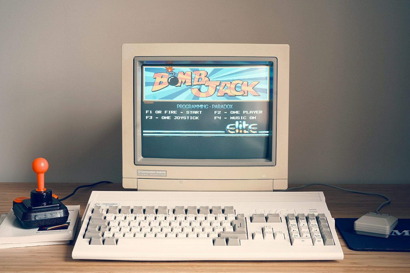
Pixel art builds images one deliberate pixel at a time, closer to mosaic than to painting. Every unit is visible and intentional. Fun detail: it often looked better on old CRT screens than it does now, because the glow of the phosphor softened edges and blended colors.

Glitch

Glitch art takes digital errors (corrupted files, compression artifacts, broken screens) and uses them on purpose. Datamoshing, for example, manipulates video compression to make scenes melt into each other. It's a critique of the digital world's promise of clean perfection, showing the cracks as content.

Y2K

The look of the millennium turn: chrome, glossy bubbles, bevel and emboss, lens flares, techno type and neon on space-themed backgrounds. Naive, commercial techno-optimism, and so dated it became iconic. Memphis and camp, rendered in 3D.

Vaporwave

An internet-native music and visual style from the early 2010s (Macintosh Plus's album Floral Shoppe, 2011, is the usual reference point). Pastel pink and cyan, Windows 95 windows, CRTs, classical busts, Japanese type, wireframe grids and rendered sunsets, all run through VHS noise. It feeds on consumer culture (malls, corporate branding, stock imagery) to mock it and love it at the same time. Critics often describe it with the idea of "hauntology": nostalgia for a future that never arrived. It's postmodernism, remixed through memes.

The three eras side by side

After three articles, here's the whole arc in one place:

  • Where truth comes from: Premodern: God, tradition, classical authority; Modern: Reason and science; Postmodern: Constructed, plural, situated
  • History is: Premodern: Ordered by divine plan; Modern: Linear progress; Postmodern: Fragmented, non-linear
  • Ornament: Premodern: Essential: status and meaning; Modern: A crime, remove it; Postmodern: Valid, often ironic
  • The grid: Premodern: Intuitive symmetry, classical proportion; Modern: Rational modular structure; Postmodern: Something to break and play with
  • Typography: Premodern: Calligraphic, decorative; Modern: Functional, sans-serif; Postmodern: Layered, fragmented, sometimes illegible
  • The author: Premodern: Anonymous craftsperson; Modern: Heroic individual genius; Postmodern: "Dead" (Roland Barthes, 1967); meaning belongs to the reader
  • The risk: Premodern: Stagnation and dogma; Modern: Totalizing ideology; Postmodern: Nihilism and relativism

The last row matters most. Every era has a failure mode. Premodern certainty can freeze into dogma. Modern universalism can steamroll anyone who doesn't fit the "universal." Postmodern skepticism can slide into believing nothing matters.

Try this

Look at the last three things you saved on Pinterest, Behance or Instagram. For each one, decide which era's values it's running on. Then ask what you'd lose, and what you'd gain, if you remade it with the values of a different era.

Articles

Menu

→ Home

Portfolio

Services

Links

About

Design history

May 31, 2026

·

7 min read

Design History in Three Cultural Eras, Part 3: Postmodern Graphic Design and the Digital Age

Psychedelic posters, punk, Memphis, David Carson, Emigre, pixel art and vaporwave: how postmodern doubt became the look of modern media.

Modernist designers spent decades arguing that the best typography is invisible and the best layout gets out of the way. Then, starting in the 1960s, a lot of very talented people made work that was hard to read on purpose, and it worked. How did "illegible" become a legitimate design choice?

This is the last part of a three-part series. Part 1: Before Modernism covered the premodern era, when truth came from God and tradition. Part 2: Modernism and the Birth of Postmodern Thought followed the faith in reason and progress, and the postmodern doubt that replaced it. Here we take that doubt into actual graphic design: posters, record sleeves, magazines, typefaces and, eventually, screens.

Psychedelia (roughly 1965 to 1972, San Francisco)

The center was San Francisco around 1967: the hippie movement, the Vietnam War and LSD in the counterculture. A group of artists started making concert posters for venues like the Fillmore and the Avalon Ballroom that were, by design, hard to read.

That was the point. If you weren't part of the scene, the poster wasn't talking to you. It may be the first design movement where subjective experience clearly mattered more than clear communication. The visual traits:

  • Lettering that seems to melt or vibrate, filling every inch of the shape it sits in
  • Hypersaturated, clashing colors chosen to make your eyes buzz
  • Organic forms, spirals, mandalas and optical effects
  • Art Nouveau, Surrealism and pop culture mixed freely, with no hierarchy

Wes Wilson and Victor Moscoso are the names to know. The same scene fed Zap Comix (first issue 1968, final issue 2014), where R. Crumb, Moscoso, Rick Griffin, S. Clay Wilson and others built the look of underground comics.

Punk (late 1970s, UK and US)

If psychedelia was illegible because of a trance, punk was illegible because of rage. Do it yourself, and reject professional polish. Letters cut from newspapers like a ransom note, cheap photocopies, typewriter type. Ugly was honest; polished was a corporate lie.

The key designer is Jamie Reid, whose work for the Sex Pistols (God Save the Queen, 1977, and Never Mind the Bollocks) defined the look.

New Wave and post-punk (late 1970s and 1980s, UK)

The grown-up version of punk. It brought back modernist structure (grids, Swiss-style type) and used it with ironic distance. Clean geometry, bright color on dark backgrounds, and borrowed references to De Stijl, Futurism and the Bauhaus, now dressed up for rock bands. Record sleeves became conceptual design objects.

Peter Saville is the defining figure, with his work for Factory Records, Joy Division's Unknown Pleasures (1979) and New Order's Power, Corruption & Lies (1983).

The rebellion inside the design schools

While punks attacked design from the outside, some teachers attacked it from within.

Wolfgang Weingart, teaching at the Basel School of Design (the heart of the Swiss Style) from 1968, pushed metal type to its limits: stepped and layered compositions, overlapping screens, type as texture. He took the Swiss grid seriously enough to break it with intent, and he taught a generation that included April Greiman and Dan Friedman.

April Greiman carried that energy to California and to the computer. She was among the first designers to adopt the Apple Macintosh (released in 1984) as a serious design tool, mixing photography, video stills, type and visible pixels. Her issue of Design Quarterly 133 (1986) folded out into a life-size, digitally assembled nude self-portrait poster. She's the bridge between Basel and the digital revolution.

Memphis (1981 to 1988, Milan)

In Italy, a collective went further and rejected the very idea of "good design." Memphis, led by Ettore Sottsass, launched in 1981 with furniture and objects in loud colors, cheap plastic laminates, clashing patterns and toy-like shapes. It freed furniture, product and graphic design from strict functionalism. David Bowie was a serious collector. If 1980s TV graphics come to mind when you hear "Memphis," that's no accident.

Camp and kitsch

Postmodernism rehabilitated two categories modernism despised:

  • Kitsch: the commercial, the sentimental, what elites dismissed as cheap or tasteless.
  • Camp: the ironic, self-aware embrace of the "awful" until it becomes art, so bad it's good.

The key text is Susan Sontag's essay Notes on "Camp" (1964). The creative tools here are irony, a real appreciation of popular and commercial culture, and excess.

The 1990s: legibility becomes optional

The 1990s radicalized all of this. The defining figure is David Carson, art director of Beach Culture and then Ray Gun. He came to design late, from teaching and professional surfing, with little formal training, and treated type as image rather than text. The most repeated story: he set an entire Ray Gun interview with Bryan Ferry in Zapf Dingbats, a symbol font, because he found it boring. Legibility became a choice, not a rule.

Around him, a whole wave of experimental work: Neville Brody (The Face, Arena, and co-founder of FontShop), Vaughan Oliver (the visual identity of 4AD Records, for bands like Pixies and Cocteau Twins), and The Designers Republic in Sheffield (Warp Records, Aphex Twin, the Wipeout video game). Dirty textures, distorted type and heavy layering became a style, sometimes called grunge, in parallel with the music.

The tools change everything

None of that 1990s work happens without the software. The key dates:

  • 1984: Apple Macintosh, the first commercially successful computer with a graphical interface
  • 1987: Adobe Illustrator and QuarkXPress
  • 1990: Adobe Photoshop
  • 1999: Adobe InDesign, which eventually displaced Quark

The tools you have shape what you can make. Once you didn't need a print shop to experiment, styles multiplied, amateur design exploded, and new forms (digital collage, layered type, generative images) became possible.

Emigre (1984 to 2005), the magazine and type foundry run by Zuzana Licko and Rudy VanderLans, is the emblem of the moment. It published digital typefaces by independent designers long before the web made that easy, including Licko's own Base, Mrs Eaves and Filosofia.

Digital-native aesthetics

From here, the story moves onto screens, and new styles grow out of the machines themselves.

Algorithmic art

In the 1960s and 1970s, artists like Frieder Nake, Georg Nees, Vera Molnár and Harold Cohen used mainframes and plotters to generate images from code. It's one of the first times mathematics was used programmatically to make visual work. In the 1980s, Benoit Mandelbrot's fractal geometry, patterns that repeat at every scale, became a popular aesthetic in its own right.

ASCII art and emoticons

Pictures made from text characters go back to the early days of computing, printed on teletypes and line printers before screens were common. In the 1980s, bulletin board systems (BBS, the online communities before the web) spread text art widely. In 1982, Scott Fahlman proposed :-) to mark jokes on a university message board. Emoticons are the direct ancestors of emoji.

Pixel art

Pixel art builds images one deliberate pixel at a time, closer to mosaic than to painting. Every unit is visible and intentional. Fun detail: it often looked better on old CRT screens than it does now, because the glow of the phosphor softened edges and blended colors.

Glitch

Glitch art takes digital errors (corrupted files, compression artifacts, broken screens) and uses them on purpose. Datamoshing, for example, manipulates video compression to make scenes melt into each other. It's a critique of the digital world's promise of clean perfection, showing the cracks as content.

Y2K

The look of the millennium turn: chrome, glossy bubbles, bevel and emboss, lens flares, techno type and neon on space-themed backgrounds. Naive, commercial techno-optimism, and so dated it became iconic. Memphis and camp, rendered in 3D.

Vaporwave

An internet-native music and visual style from the early 2010s (Macintosh Plus's album Floral Shoppe, 2011, is the usual reference point). Pastel pink and cyan, Windows 95 windows, CRTs, classical busts, Japanese type, wireframe grids and rendered sunsets, all run through VHS noise. It feeds on consumer culture (malls, corporate branding, stock imagery) to mock it and love it at the same time. Critics often describe it with the idea of "hauntology": nostalgia for a future that never arrived. It's postmodernism, remixed through memes.

The three eras side by side

After three articles, here's the whole arc in one place:

  • Where truth comes from: Premodern: God, tradition, classical authority; Modern: Reason and science; Postmodern: Constructed, plural, situated
  • History is: Premodern: Ordered by divine plan; Modern: Linear progress; Postmodern: Fragmented, non-linear
  • Ornament: Premodern: Essential: status and meaning; Modern: A crime, remove it; Postmodern: Valid, often ironic
  • The grid: Premodern: Intuitive symmetry, classical proportion; Modern: Rational modular structure; Postmodern: Something to break and play with
  • Typography: Premodern: Calligraphic, decorative; Modern: Functional, sans-serif; Postmodern: Layered, fragmented, sometimes illegible
  • The author: Premodern: Anonymous craftsperson; Modern: Heroic individual genius; Postmodern: "Dead" (Roland Barthes, 1967); meaning belongs to the reader
  • The risk: Premodern: Stagnation and dogma; Modern: Totalizing ideology; Postmodern: Nihilism and relativism

The last row matters most. Every era has a failure mode. Premodern certainty can freeze into dogma. Modern universalism can steamroll anyone who doesn't fit the "universal." Postmodern skepticism can slide into believing nothing matters.

Try this

Look at the last three things you saved on Pinterest, Behance or Instagram. For each one, decide which era's values it's running on. Then ask what you'd lose, and what you'd gain, if you remade it with the values of a different era.

Design history

May 31, 2026

·

7 min read

Design History in Three Cultural Eras, Part 3: Postmodern Graphic Design and the Digital Age

Psychedelic posters, punk, Memphis, David Carson, Emigre, pixel art and vaporwave: how postmodern doubt became the look of modern media.

Modernist designers spent decades arguing that the best typography is invisible and the best layout gets out of the way. Then, starting in the 1960s, a lot of very talented people made work that was hard to read on purpose, and it worked. How did "illegible" become a legitimate design choice?

This is the last part of a three-part series. Part 1: Before Modernism covered the premodern era, when truth came from God and tradition. Part 2: Modernism and the Birth of Postmodern Thought followed the faith in reason and progress, and the postmodern doubt that replaced it. Here we take that doubt into actual graphic design: posters, record sleeves, magazines, typefaces and, eventually, screens.

Psychedelia (roughly 1965 to 1972, San Francisco)

The center was San Francisco around 1967: the hippie movement, the Vietnam War and LSD in the counterculture. A group of artists started making concert posters for venues like the Fillmore and the Avalon Ballroom that were, by design, hard to read.

That was the point. If you weren't part of the scene, the poster wasn't talking to you. It may be the first design movement where subjective experience clearly mattered more than clear communication. The visual traits:

  • Lettering that seems to melt or vibrate, filling every inch of the shape it sits in
  • Hypersaturated, clashing colors chosen to make your eyes buzz
  • Organic forms, spirals, mandalas and optical effects
  • Art Nouveau, Surrealism and pop culture mixed freely, with no hierarchy

Wes Wilson and Victor Moscoso are the names to know. The same scene fed Zap Comix (first issue 1968, final issue 2014), where R. Crumb, Moscoso, Rick Griffin, S. Clay Wilson and others built the look of underground comics.

Punk (late 1970s, UK and US)

If psychedelia was illegible because of a trance, punk was illegible because of rage. Do it yourself, and reject professional polish. Letters cut from newspapers like a ransom note, cheap photocopies, typewriter type. Ugly was honest; polished was a corporate lie.

The key designer is Jamie Reid, whose work for the Sex Pistols (God Save the Queen, 1977, and Never Mind the Bollocks) defined the look.

New Wave and post-punk (late 1970s and 1980s, UK)

The grown-up version of punk. It brought back modernist structure (grids, Swiss-style type) and used it with ironic distance. Clean geometry, bright color on dark backgrounds, and borrowed references to De Stijl, Futurism and the Bauhaus, now dressed up for rock bands. Record sleeves became conceptual design objects.

Peter Saville is the defining figure, with his work for Factory Records, Joy Division's Unknown Pleasures (1979) and New Order's Power, Corruption & Lies (1983).

The rebellion inside the design schools

While punks attacked design from the outside, some teachers attacked it from within.

Wolfgang Weingart, teaching at the Basel School of Design (the heart of the Swiss Style) from 1968, pushed metal type to its limits: stepped and layered compositions, overlapping screens, type as texture. He took the Swiss grid seriously enough to break it with intent, and he taught a generation that included April Greiman and Dan Friedman.

April Greiman carried that energy to California and to the computer. She was among the first designers to adopt the Apple Macintosh (released in 1984) as a serious design tool, mixing photography, video stills, type and visible pixels. Her issue of Design Quarterly 133 (1986) folded out into a life-size, digitally assembled nude self-portrait poster. She's the bridge between Basel and the digital revolution.

Memphis (1981 to 1988, Milan)

In Italy, a collective went further and rejected the very idea of "good design." Memphis, led by Ettore Sottsass, launched in 1981 with furniture and objects in loud colors, cheap plastic laminates, clashing patterns and toy-like shapes. It freed furniture, product and graphic design from strict functionalism. David Bowie was a serious collector. If 1980s TV graphics come to mind when you hear "Memphis," that's no accident.

Camp and kitsch

Postmodernism rehabilitated two categories modernism despised:

  • Kitsch: the commercial, the sentimental, what elites dismissed as cheap or tasteless.
  • Camp: the ironic, self-aware embrace of the "awful" until it becomes art, so bad it's good.

The key text is Susan Sontag's essay Notes on "Camp" (1964). The creative tools here are irony, a real appreciation of popular and commercial culture, and excess.

The 1990s: legibility becomes optional

The 1990s radicalized all of this. The defining figure is David Carson, art director of Beach Culture and then Ray Gun. He came to design late, from teaching and professional surfing, with little formal training, and treated type as image rather than text. The most repeated story: he set an entire Ray Gun interview with Bryan Ferry in Zapf Dingbats, a symbol font, because he found it boring. Legibility became a choice, not a rule.

Around him, a whole wave of experimental work: Neville Brody (The Face, Arena, and co-founder of FontShop), Vaughan Oliver (the visual identity of 4AD Records, for bands like Pixies and Cocteau Twins), and The Designers Republic in Sheffield (Warp Records, Aphex Twin, the Wipeout video game). Dirty textures, distorted type and heavy layering became a style, sometimes called grunge, in parallel with the music.

The tools change everything

None of that 1990s work happens without the software. The key dates:

  • 1984: Apple Macintosh, the first commercially successful computer with a graphical interface
  • 1987: Adobe Illustrator and QuarkXPress
  • 1990: Adobe Photoshop
  • 1999: Adobe InDesign, which eventually displaced Quark

The tools you have shape what you can make. Once you didn't need a print shop to experiment, styles multiplied, amateur design exploded, and new forms (digital collage, layered type, generative images) became possible.

Emigre (1984 to 2005), the magazine and type foundry run by Zuzana Licko and Rudy VanderLans, is the emblem of the moment. It published digital typefaces by independent designers long before the web made that easy, including Licko's own Base, Mrs Eaves and Filosofia.

Digital-native aesthetics

From here, the story moves onto screens, and new styles grow out of the machines themselves.

Algorithmic art

In the 1960s and 1970s, artists like Frieder Nake, Georg Nees, Vera Molnár and Harold Cohen used mainframes and plotters to generate images from code. It's one of the first times mathematics was used programmatically to make visual work. In the 1980s, Benoit Mandelbrot's fractal geometry, patterns that repeat at every scale, became a popular aesthetic in its own right.

ASCII art and emoticons

Pictures made from text characters go back to the early days of computing, printed on teletypes and line printers before screens were common. In the 1980s, bulletin board systems (BBS, the online communities before the web) spread text art widely. In 1982, Scott Fahlman proposed :-) to mark jokes on a university message board. Emoticons are the direct ancestors of emoji.

Pixel art

Pixel art builds images one deliberate pixel at a time, closer to mosaic than to painting. Every unit is visible and intentional. Fun detail: it often looked better on old CRT screens than it does now, because the glow of the phosphor softened edges and blended colors.

Glitch

Glitch art takes digital errors (corrupted files, compression artifacts, broken screens) and uses them on purpose. Datamoshing, for example, manipulates video compression to make scenes melt into each other. It's a critique of the digital world's promise of clean perfection, showing the cracks as content.

Y2K

The look of the millennium turn: chrome, glossy bubbles, bevel and emboss, lens flares, techno type and neon on space-themed backgrounds. Naive, commercial techno-optimism, and so dated it became iconic. Memphis and camp, rendered in 3D.

Vaporwave

An internet-native music and visual style from the early 2010s (Macintosh Plus's album Floral Shoppe, 2011, is the usual reference point). Pastel pink and cyan, Windows 95 windows, CRTs, classical busts, Japanese type, wireframe grids and rendered sunsets, all run through VHS noise. It feeds on consumer culture (malls, corporate branding, stock imagery) to mock it and love it at the same time. Critics often describe it with the idea of "hauntology": nostalgia for a future that never arrived. It's postmodernism, remixed through memes.

The three eras side by side

After three articles, here's the whole arc in one place:

  • Where truth comes from: Premodern: God, tradition, classical authority; Modern: Reason and science; Postmodern: Constructed, plural, situated
  • History is: Premodern: Ordered by divine plan; Modern: Linear progress; Postmodern: Fragmented, non-linear
  • Ornament: Premodern: Essential: status and meaning; Modern: A crime, remove it; Postmodern: Valid, often ironic
  • The grid: Premodern: Intuitive symmetry, classical proportion; Modern: Rational modular structure; Postmodern: Something to break and play with
  • Typography: Premodern: Calligraphic, decorative; Modern: Functional, sans-serif; Postmodern: Layered, fragmented, sometimes illegible
  • The author: Premodern: Anonymous craftsperson; Modern: Heroic individual genius; Postmodern: "Dead" (Roland Barthes, 1967); meaning belongs to the reader
  • The risk: Premodern: Stagnation and dogma; Modern: Totalizing ideology; Postmodern: Nihilism and relativism

The last row matters most. Every era has a failure mode. Premodern certainty can freeze into dogma. Modern universalism can steamroll anyone who doesn't fit the "universal." Postmodern skepticism can slide into believing nothing matters.

Try this

Look at the last three things you saved on Pinterest, Behance or Instagram. For each one, decide which era's values it's running on. Then ask what you'd lose, and what you'd gain, if you remade it with the values of a different era.