
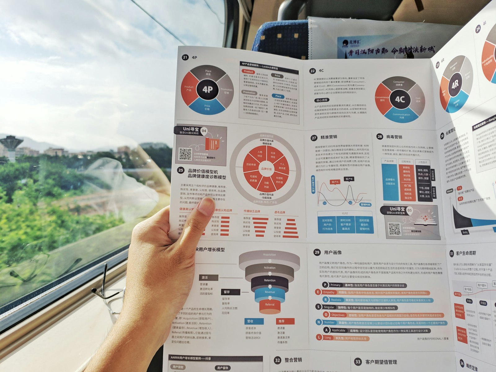
Most weak infographics fail the same way: they look busy and say little. The fix is rarely more illustration or fewer words. It's knowing what an infographic is made of, so you can check each part on purpose instead of hoping the whole thing works.
This is a field guide to those parts: the types, the visual dimensions they're built from, the structure every effective one shares, and the rules for turning numbers into shapes without lying.
Six types of infographic
Statistical. Quantitative data shown visually through charts and graphs. The priority is precision and clear numerical representation. Common in journalism and business reports.
Process. Steps and sequences over time, with directional flow. Useful for instructions and procedures, anything where order matters.
Geographic. Data placed on maps or spatial layouts to show regional differences and distribution patterns. It combines cartography with data visualization.
Comparison. Relationships between items: contrasts and similarities, usually side by side or in parallel. Good for before and after, or for comparing options.
Timeline. Chronological sequences, historical progressions and milestones, arranged along a horizontal or vertical line. They help readers see how something evolved and what caused what.
Hierarchical. Organizational structures, categories and subcategories, shown as branching or nested systems. Think org charts and taxonomies.
Real infographics often mix two or three types. That's fine, as long as one of them is the backbone and the others support it. A piece that tries to be a timeline, a map and a comparison at equal volume usually ends up being none of them.
The visual dimensions
Every infographic is built from a handful of visual properties. The cartographer Jacques Bertin formalized many of them as "visual variables" in Sémiologie graphique (1967). For everyday infographic work, five matter most.
Size. Scale creates emphasis: bigger reads as more important. Proportion also affects how readers judge the relationship between two things, which is why size has to be honest when it represents data (more on that below).
Shape. Geometric or organic, shapes carry cultural meaning. Icons and symbols depend on shape recognition, and a consistent shape vocabulary makes the whole piece feel like one system.
Color. Color carries meaning (red for alerts, green for success), creates harmony and, through contrast, improves legibility and accessibility. Color associations also change from culture to culture, so check them against your audience.
Position. Readers of left-to-right languages scan left to right and top to bottom. Proximity signals that things are related. White space around an element signals importance. Grid position creates order.
Orientation. Designers often treat horizontal lines as calm and stable, verticals as strong or growing, and diagonals as dynamic. These are conventions worth testing with your audience rather than laws, but orientation does change how a composition feels.
The parts of an effective infographic
Title
A clear, short headline that states the insight, placed at the top so it's understood immediately. The title should answer the main question the graphic raises. "Water Use by Sector" names a topic. "Farms Use More Water Than Cities" states a finding, assuming that's what your data shows. Findings are more useful.
Introduction
One or two sentences of context about the data or the topic. Its job is to answer "why should I care?" and set up the visual exploration. If it runs longer than two sentences, some of it probably belongs in the body or nowhere.
Body
The main data visualization: the visual argument. This is the most detailed section, and it should explain itself with as little text as possible. If the reader needs a paragraph to decode the chart, the chart needs work.
Source
Where the data comes from and when it was collected. It builds credibility and lets readers check your work. It's usually set small at the bottom, but it should never be missing.
Credits
Who designed and illustrated it, the publishing organization, and copyright if it applies.
Grids
A grid is the invisible structure that organizes the information. It divides the space into columns and rows, creates visual rhythm and consistency, and makes it easier to adapt the design to different sizes.
Aligning to a grid gives you:
- clear hierarchy through consistent placement
- faster scanning
- a structured, professional look
- a logical path for the eye
Good grids are flexible. You can combine modules to give one element more weight, leave modules empty so the layout can breathe, and use the same grid for dense and spacious sections alike.
Mapping data to visuals
This is where infographics most often go wrong, usually without anyone meaning to mislead.
Quantitative mapping
Numbers become visual properties: bar height stands for value, color intensity for magnitude. The encoding has to be proportional. A bar twice as tall must mean twice the value, which is why bar charts need a baseline at zero.
Be careful with area. If you double a circle's diameter to show a value that doubled, the area grows four times, and the reader sees a much bigger jump than the data contains. When you scale shapes, scale their area, not their width.
Categorical mapping
Groups are represented with distinct visual properties: a color, a shape or an icon per category. Consistency matters across the whole piece. If blue means "urban" in the first chart, it can't mean "2024" in the third. And the colors have to be distinguishable for readers with color vision deficiencies, so test your palette with a simulator.
Good practices
- Match the visual dimension to the type of data (length for quantities, hue or shape for categories).
- Use visual language your audience already understands.
- Test legibility at the final output size, not zoomed in on your screen.
- Check that your symbols are culturally appropriate for the audience.
Learning from newsrooms
Some of the best places to study infographics are publications that produce them under real constraints.
National Geographic is known for geographic and comparison graphics that combine strong illustration with data, often mixing several visual languages in one piece while keeping accuracy.
The New York Times graphics desk is known for interactive visualizations with a clear narrative structure and careful typography and color, often using animation and scrolling to tell the story.
Reuters graphics show how to produce clear visuals on breaking-news deadlines for an international audience, leaning on iconography and a visual language that works across languages.
When you study their work, don't copy the style. Reverse-engineer the structure: find the title, the introduction, the body, the source and the credits, and notice how much each one is doing.
Try this
Take an infographic you've saved as a reference and label its five parts. Then check each against the guidelines above. Does the title state a finding? Is the source there? Is any shape scaled by width instead of area? Pick the weakest part and redesign only that. It's the fastest way to see how much one part carries the whole piece.
Further reading
- Bertin, J. Semiology of Graphics (originally Sémiologie graphique, 1967).
- Lankow, J., Ritchie, J. and Crooks, R. Infographics: The Power of Visual Storytelling (Wiley, 2012).
- McCandless, D. Information Is Beautiful (Collins, 2009).
- Few, S. Now You See It: Simple Visualization Techniques for Quantitative Analysis (Analytics Press, 2009).