
Design history is usually taught as a pile of names and dates, which is exactly why most people forget it the week after the exam. Dates on their own don't stick. What sticks is the chain: this happened, so that became possible, so someone reacted against it.
This timeline keeps only the milestones that changed how visual communication works, with one line on why each one matters. Use it as a map. When a name here catches your interest, that's the thread to pull.
Before design had a name
- Around 3300 to 3200 BCE: cuneiform in Sumer. Writing starts as bookkeeping. The first visual system is an information system.
- Around 3200 BCE: Egyptian hieroglyphs. Pictures, sounds and meanings combined into one code.
- 113 CE: Trajan's Column in Rome. Its carved inscription is still a reference for the proportions of capital letters.
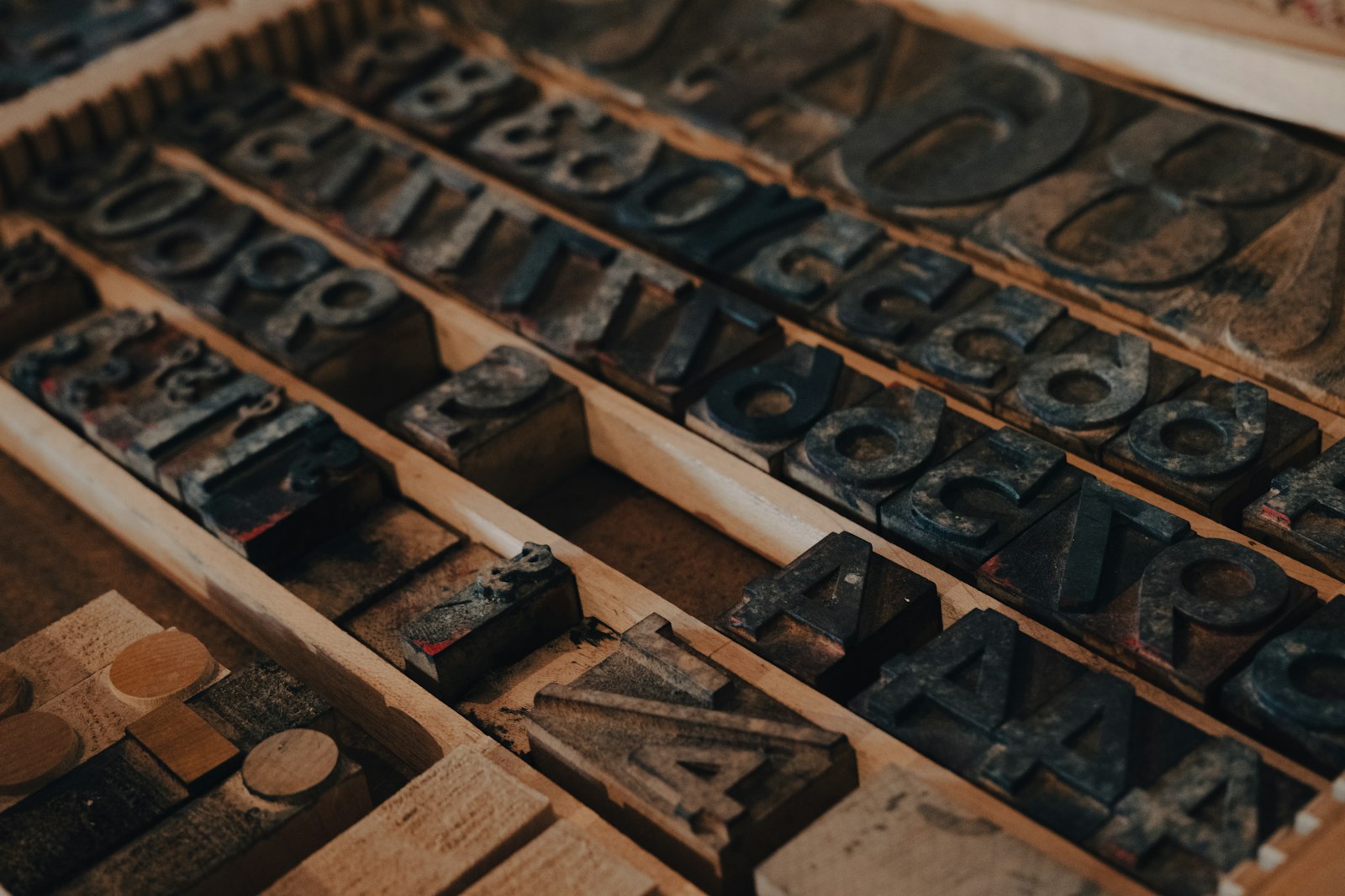
- Around 1450: Johannes Gutenberg's movable-type press. Text becomes reproducible, and ideas start moving faster than authorities can control them.
- 1796 to 1798: Alois Senefelder develops lithography. Printing images and lettering from a flat stone, the technology behind the illustrated poster.
- Around 1826 to 1827: Nicéphore Niépce's view from his window at Le Gras. The oldest surviving camera photograph.
- 1860s: Jules Chéret's color lithographic posters in Paris. The poster becomes a mass medium and street art at the same time.
1880s to 1910s: craft, curves and the first brands
- 1891: William Morris founds the Kelmscott Press. The Arts & Crafts answer to industrial ugliness: books as unified objects of type, image and binding.
- 1890s to 1914: Art Nouveau. Alphonse Mucha's posters for Sarah Bernhardt, Toulouse-Lautrec's Moulin Rouge: La Goulue (1891), Hector Guimard's Paris Métro entrances (1900). Art moves into everyday life.
- Around 1906: Lucian Bernhard's Sachplakat (object poster). Just the product and the brand name. Radical reduction, and a preview of modern advertising.
- 1907: Peter Behrens starts working for AEG. Often described as the first corporate identity: buildings, products, catalogs and type under one designer's direction.
1909 to 1933: the avant-gardes
- 1909: Marinetti's Manifesto of Futurism. Speed, machines, and type set free from the straight line.
- 1914 to 1918: First World War posters. Alfred Leete's Kitchener (1914) and James Montgomery Flagg's I Want You for U.S. Army (1917) point straight at the viewer. Governments discover design at industrial scale.
- 1916: Dada at the Cabaret Voltaire, Zurich. Anti-art, chance and photomontage. Hannah Höch's Cut with the Kitchen Knife (1919 to 1920) follows.
- 1917: De Stijl magazine launches. Theo van Doesburg and Piet Mondrian reduce form to lines, right angles and primaries.
- 1919: El Lissitzky's Beat the Whites with the Red Wedge. Constructivism proves pure geometry can carry a political message.
- 1919: Walter Gropius founds the Bauhaus in Weimar. It moves to Dessau (1925) and Berlin (1932), and closes under Nazi pressure in 1933.
- 1924: André Breton's Manifesto of Surrealism. The unconscious as a creative source. Magritte's The Treachery of Images follows in 1929.
- 1925: Herbert Bayer's Universal alphabet. Lowercase only, pure geometry.
1920s to 1940s: modern type and Art Deco
- 1927: Paul Renner's Futura. The geometric sans-serif becomes a commercial reality.
- 1927: A.M. Cassandre's Étoile du Nord poster. Art Deco synthesis: one image, one message, no noise.
- 1928: Jan Tschichold's Die neue Typographie. Asymmetric layout and sans-serifs turned into rules. (He later went back to classical typography.)
- 1928: Eric Gill's Gill Sans.
- 1930 to 1931: Chrysler Building and Empire State Building. Art Deco as the face of the modern city.
- 1932: Times New Roman debuts in The Times of London, supervised by Stanley Morison. The same year, Beatrice Warde's essay "The Crystal Goblet" argues that good typography should be invisible.
- 1943: We Can Do It! by J. Howard Miller. A wartime factory poster that decades later became a global feminist icon.
1950s and 1960s: two answers after the war
- 1950s: the Swiss Style (International Typographic Style). Grids, sans-serifs, objective photography. Josef Müller-Brockmann, Armin Hofmann, Emil Ruder, Max Bill.
- 1954: Push Pin Studios. Milton Glaser, Seymour Chwast and others bring illustration, history and humor back.
- 1955 to 1960: Saul Bass's film titles. The Man with the Golden Arm (1955), Vertigo (1958), Psycho (1960). Graphic design learns to move.
- 1956: Paul Rand's IBM logo. The striped version arrives in 1972. The New York School's designer-as-thinker at work.
- 1957: Helvetica and Univers. Max Miedinger and Eduard Hoffmann's Neue Haas Grotesk (renamed Helvetica in 1960) and Adrian Frutiger's Univers appear the same year.
- 1964: First Things First. Ken Garland's manifesto asks designers to prioritize useful work over trivial advertising. Renewed in 2000 and 2020.
- 1966 to 1967: psychedelic concert posters in San Francisco. Wes Wilson and Victor Moscoso make illegibility part of the message.
- 1968: Lance Wyman's identity for the Mexico City Olympics, followed by the Mexico City Metro pictograms (1969).
- 1968: Avant Garde magazine, with Herb Lubalin's famous logotype.
1970s: ethics and rebellion
- 1971: Victor Papanek's Design for the Real World. The designer's social responsibility, argued without mercy.
- 1970s: Dieter Rams's ten principles of good design, developed during his decades at Braun.
- 1977: Milton Glaser's I ❤ NY.
- 1977: Jamie Reid's God Save the Queen for the Sex Pistols. Punk's ransom-note DIY aesthetic.
- 1970s: Wolfgang Weingart at the Basel School of Design. The Swiss Style questioned from inside its own school.
1980s: postmodern and personal computers
- 1979 and 1983: Peter Saville's covers for Joy Division and New Order. Unknown Pleasures and Power, Corruption & Lies.
- 1981: Memphis in Milan. Ettore Sottsass and friends reject "good taste" with color and laminate.
- 1984: the Apple Macintosh. The first commercially successful computer with a graphical interface.
- 1984: Emigre magazine. Zuzana Licko and Rudy VanderLans design for, and with, the bitmap.
- 1985: PostScript, the LaserWriter and Aldus PageMaker. Desktop publishing is born.
- 1986: April Greiman's Design Quarterly 133 poster. The computer as a visible, expressive tool.
- 1987: Adobe Illustrator and QuarkXPress.
- 1988: Don Norman's The Psychology of Everyday Things, later retitled The Design of Everyday Things.
1990s: the digital explosion
- 1990: Adobe Photoshop 1.0.
- 1991: the World Wide Web goes public. Tim Berners-Lee's project opens to everyone.
- 1991: FF Meta by Erik Spiekermann. And Colors magazine launches with Tibor Kalman as editor.
- 1992 to 1995: David Carson at Ray Gun. Legibility becomes optional.
- 1996: Georgia and Verdana by Matthew Carter. Typefaces designed for the screen first.
- 1996: CSS and OpenType. Style separates from structure on the web, and a new cross-platform font format is announced.
- 1998: Bruce Mau's "Incomplete Manifesto for Growth."
- 1999: Adobe InDesign.
2000s: interfaces and experience
- 2000: Gotham by Tobias Frere-Jones. Later the typeface of Obama's 2008 campaign.
- 2001: the iPod. Product design as the main difference between competitors.
- 2002: Jesse James Garrett's The Elements of User Experience. A layered model for designing websites.
- 2007: the iPhone. Touch interfaces go mainstream, with skeuomorphic metaphors to teach them.
- 2008: Shepard Fairey's Hope poster. Street art and political campaigning merge.
- 2009: Tim Brown's Change by Design. Design thinking goes to business school.
2010s to now: systems, screens and responsibility
- 2010: Ethan Marcotte names "responsive web design." One layout, every screen.
- 2010: Google Fonts launches. Free, quality web typography for everyone.
- 2013: iOS 7. Flat design replaces skeuomorphism.
- 2013: Dunne and Raby's Speculative Everything.
- 2014: Google's Material Design. The design system goes public, and every large company starts building its own.
- 2016: Figma opens to the public. Design moves into the browser and becomes collaborative by default.
- 2016: variable fonts (OpenType 1.8). One file, a continuous range of weights and widths.
- 2016: Ruben Pater's The Politics of Design.
- 2020: Sasha Costanza-Chock's Design Justice. Designing with communities, not only for them.
- 2022 onward: diffusion-based image generators reach the public. Authorship, training data and bias become everyday design questions.
How it all connects
Read the list again and you'll see a rhythm. Every movement is a response to the one before:
- Arts & Crafts rejects industry.
- Art Nouveau marries craft with new materials.
- The avant-gardes (Bauhaus, Constructivism, De Stijl) embrace the machine and geometry.
- The Swiss Style turns that into rational, objective systems.
- The New York School and later postmodernism push back against Swiss coldness.
- Punk, psychedelia, New Wave and Memphis break the rules loudly.
- Grunge and early digital design make those broken rules easy to produce.
- Contemporary design tries to balance form and function with sustainability and social commitment.
Modernism believed in universal answers. Postmodernism questioned that. Much of today's work is trying to find a way to be useful without pretending to be neutral.
Try this
Pick one entry from this timeline that you knew nothing about. Find one image from it and put it next to something made in the last year that clearly borrows from it. Write two sentences: what the new piece kept, and what it dropped.
Further reading
- Philip B. Meggs and Alston W. Purvis, Meggs' History of Graphic Design (6th ed., 2016)
- Jens Müller, The History of Graphic Design, Vol. 1: 1890 to 1959 (Taschen, 2017) and Vol. 2: 1960 to Today (2018)
- Steven Heller and Véronique Vienne, 100 Ideas that Changed Graphic Design (2012)